
Overview
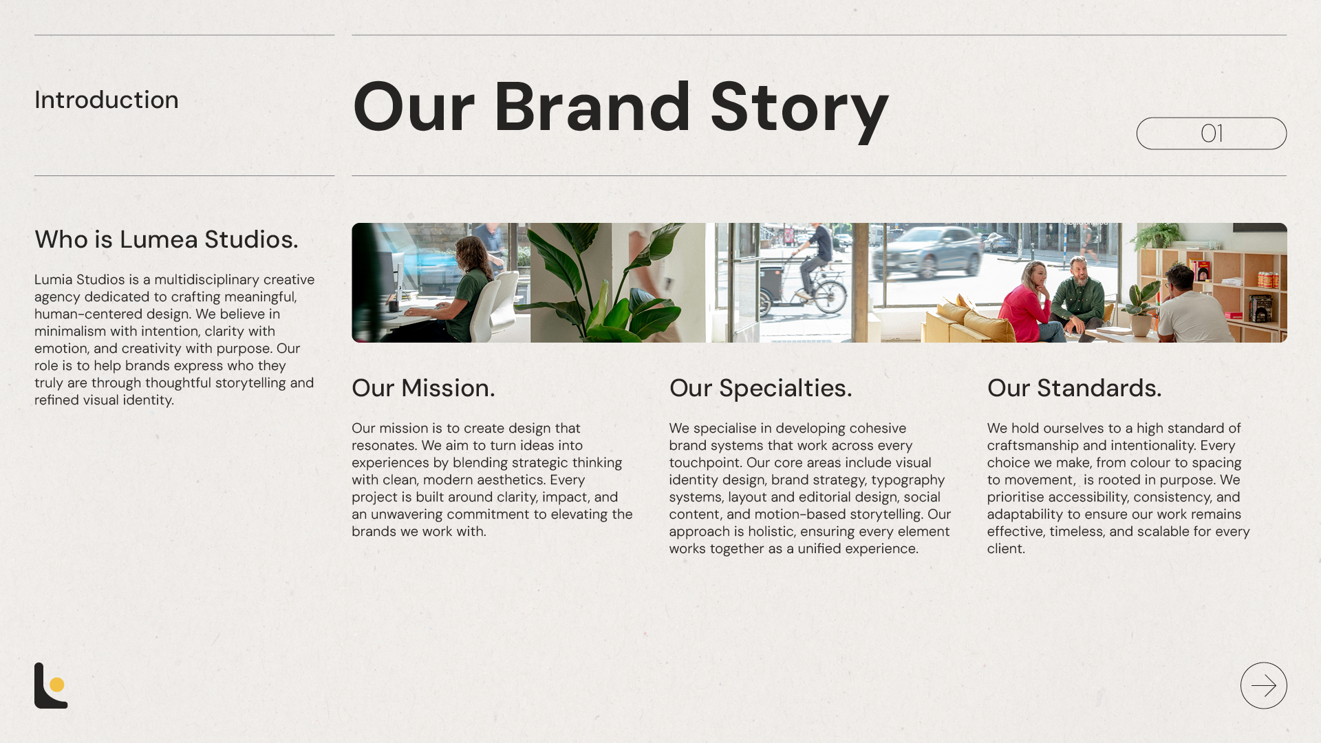
Lumea Studios is a conceptual creative agency built on minimalism, clarity, and emotional impact. The brand acts as a canvas for clients, bringing their ideas to life through intentional, human-focused design. This project establishes Lumea’s core identity and visual direction.
Objective
The objective was to create a clear and adaptable brand guideline that reflects Lumea’s minimalist approach while allowing room for creative expression. The challenge was developing a system that is consistent, flexible, and ready to support future client work.
Impact & Design Results
The result is a cohesive brand guideline that strengthens recognition and consistency across all touchpoints. Motion graphic elements were also created to add movement and life to the brand, enhancing its presence across social media and digital platforms.
Client
Lumea Studios — Creative Agency
Role
Brand & Visual Designer - Graphic & Motion Design
Project Type
Conceptual | Branding & Guidelines | Motion Graphics | Social Media
Tools Used
InDesign, Illustrator, Photoshop, AfterEffects
Branding
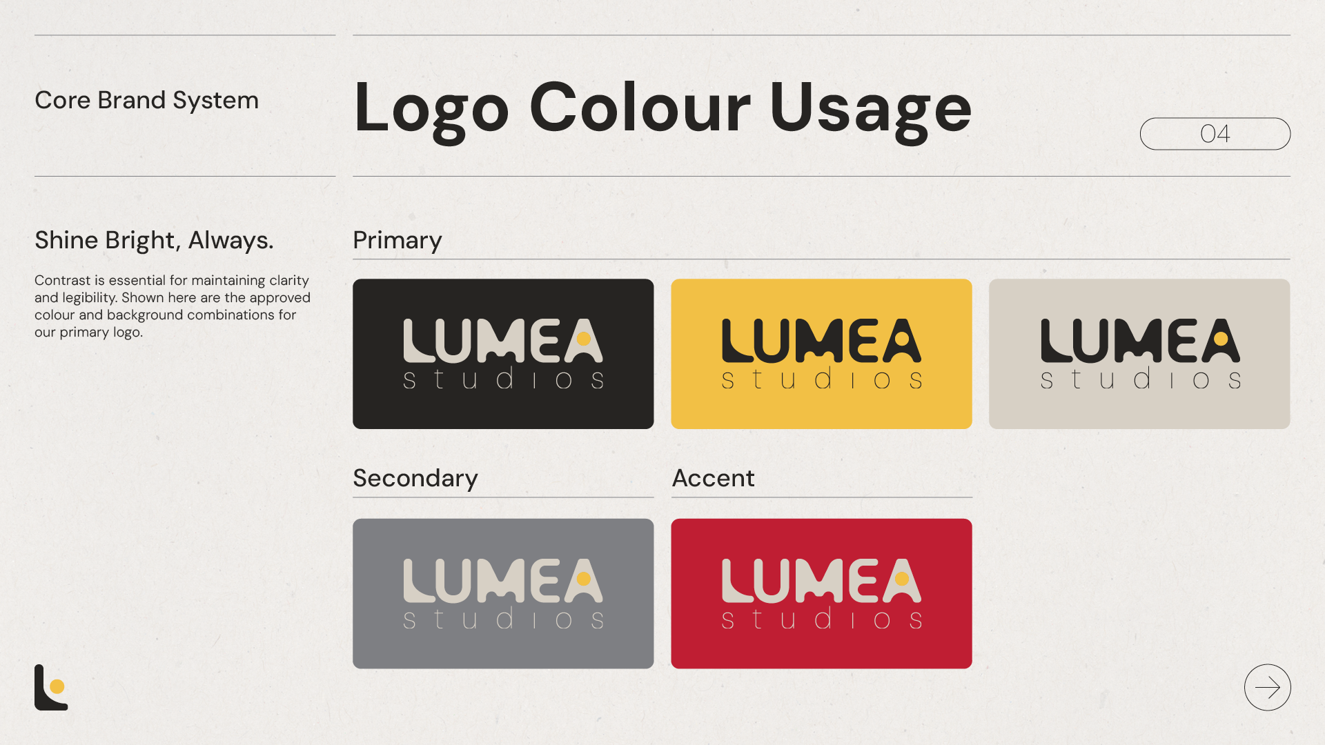
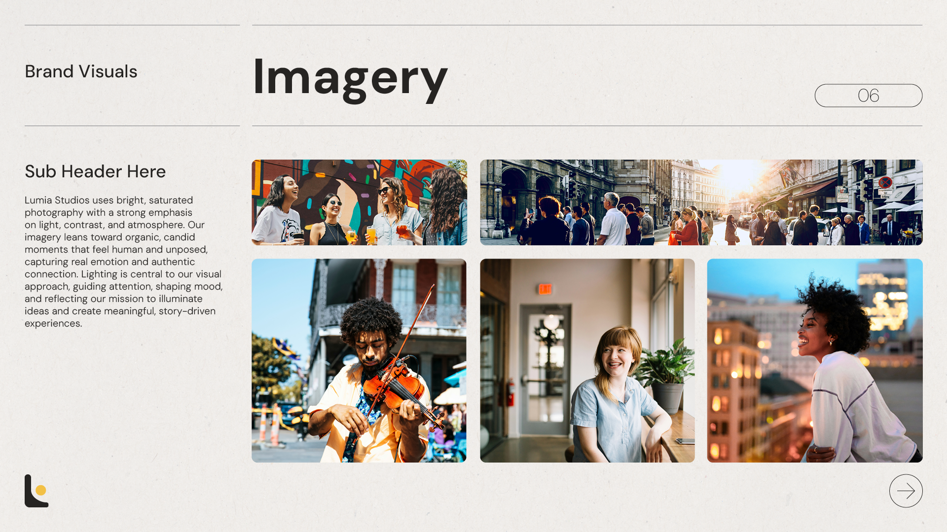
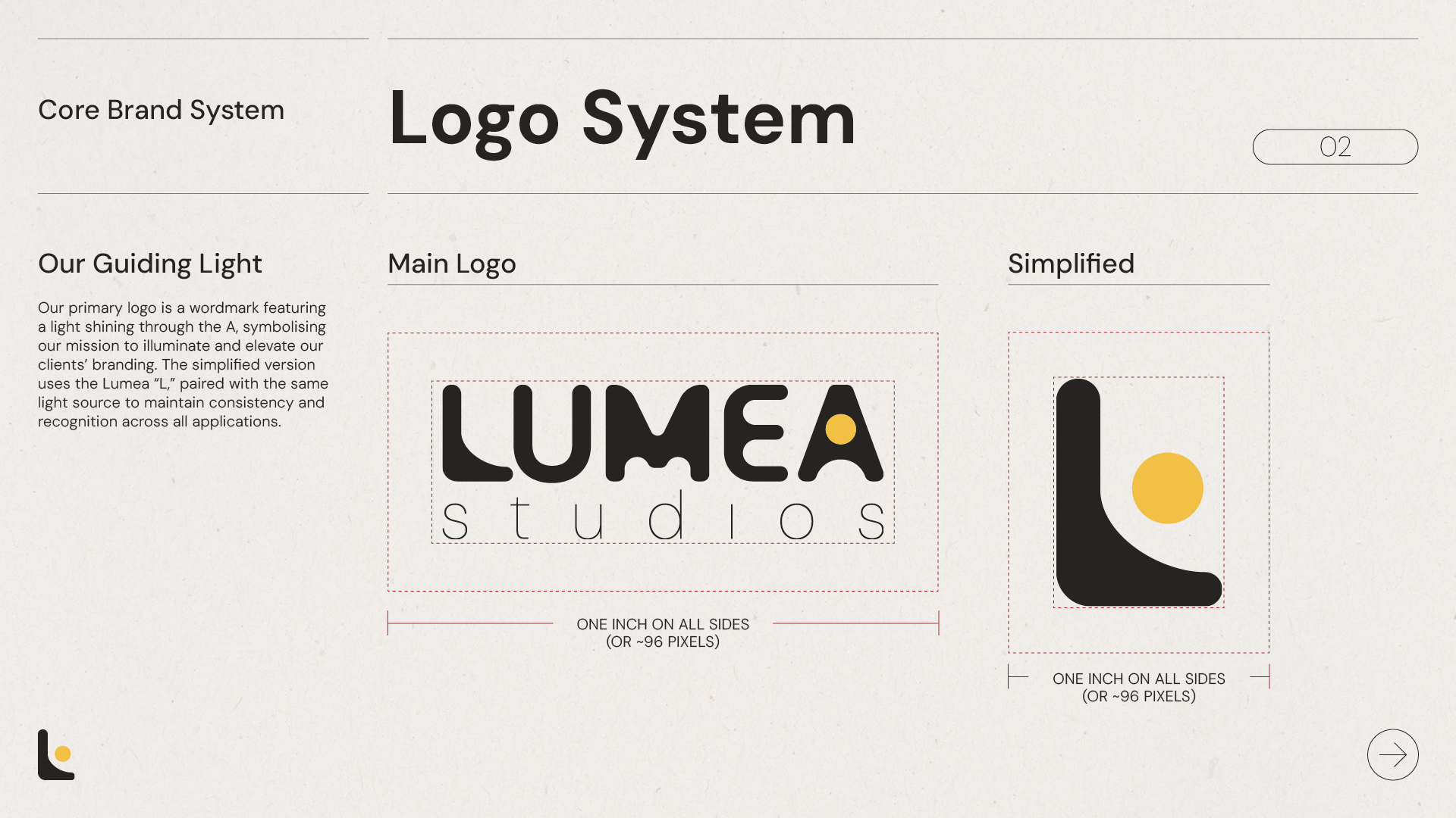
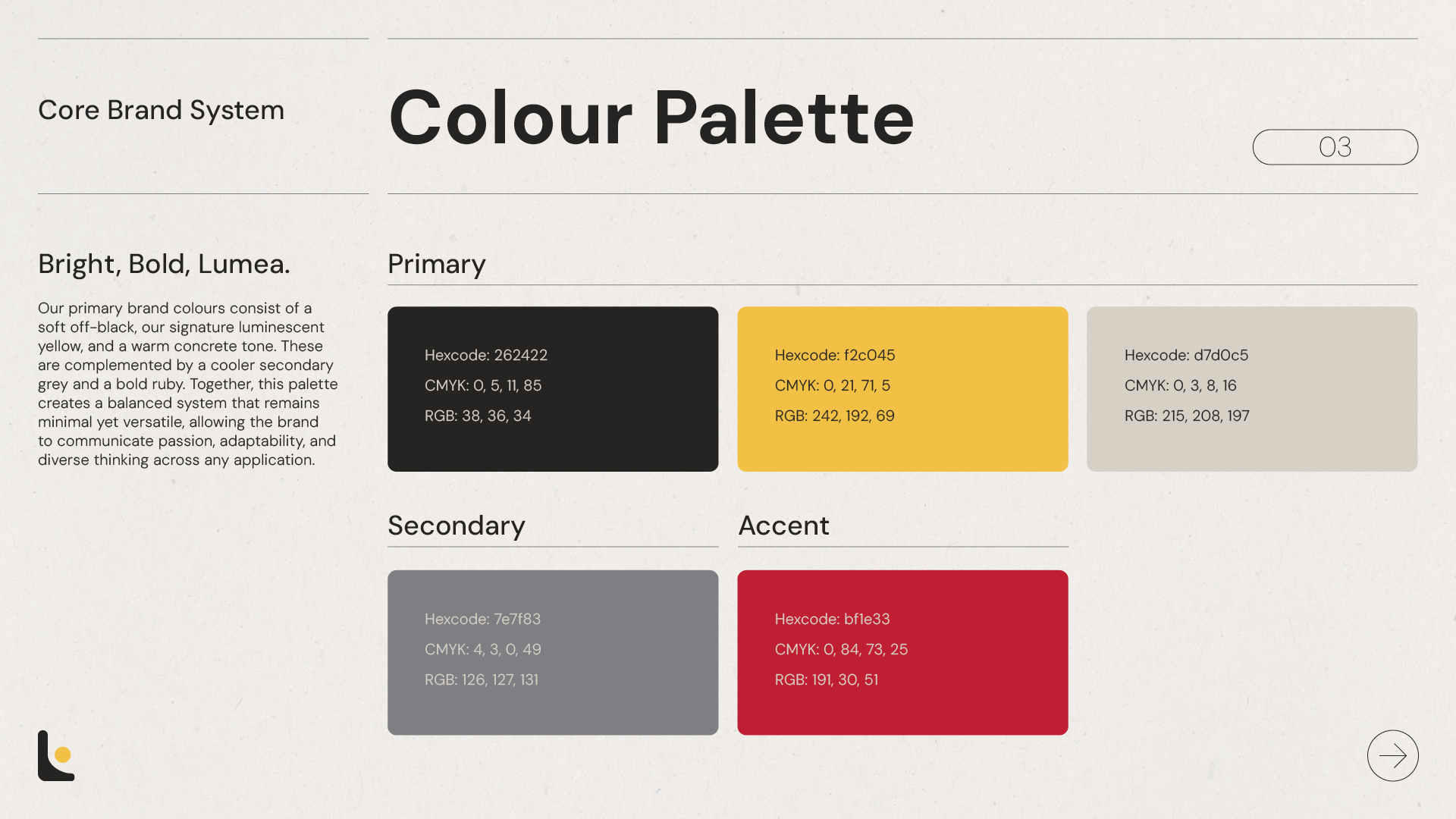
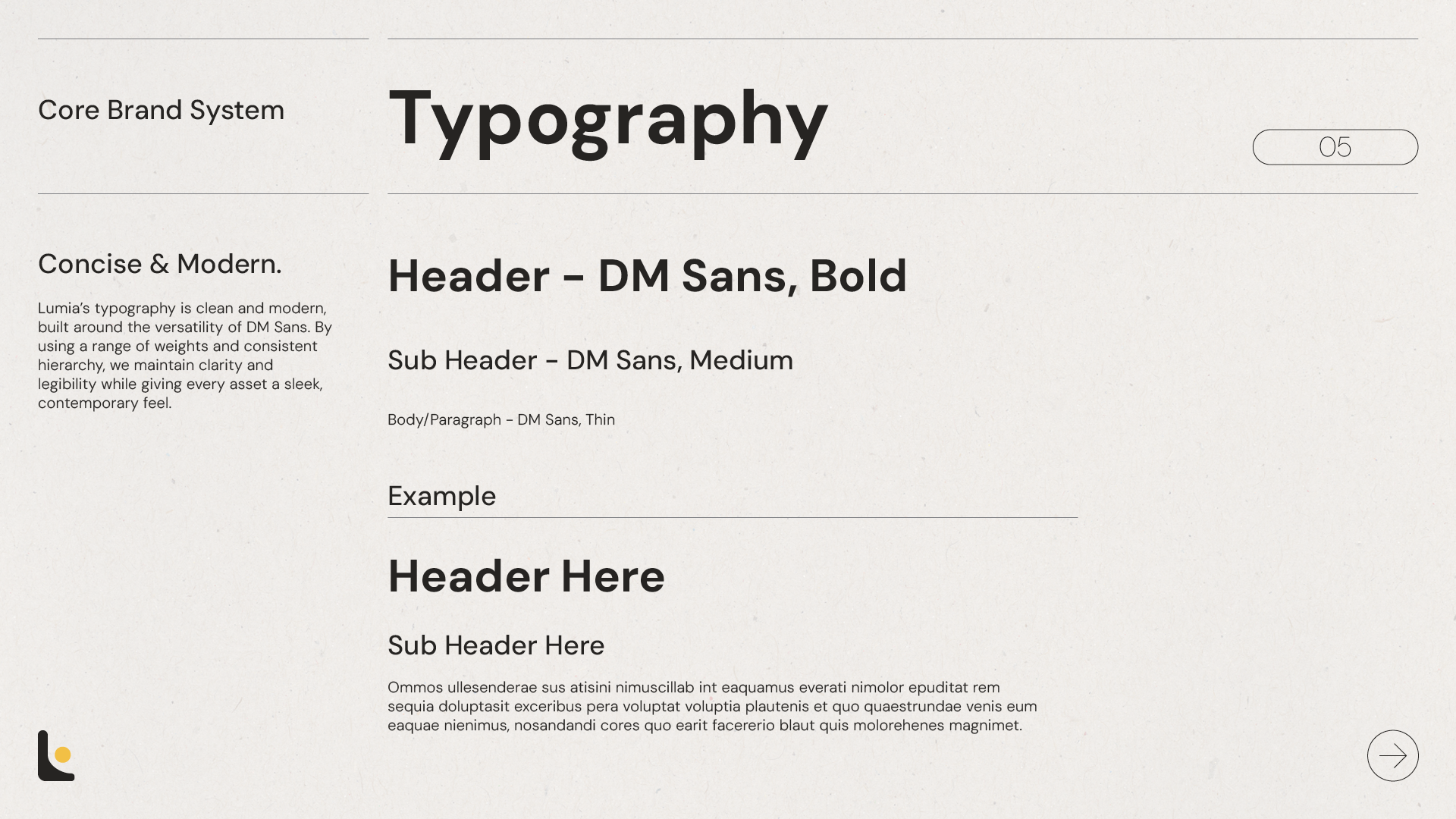
Lumia Studios’ branding balances minimalism with warmth, using a palette of luminescent yellow, rich crimson, warm concrete, and soft off-black to create a clean yet expressive visual identity. The focus on lighting and contrast reinforces the studio’s mission to illuminate ideas and bring clarity to every project. DM Sans serves as the primary typeface, supporting a modern, approachable tone across both digital and static applications.
Deliverables
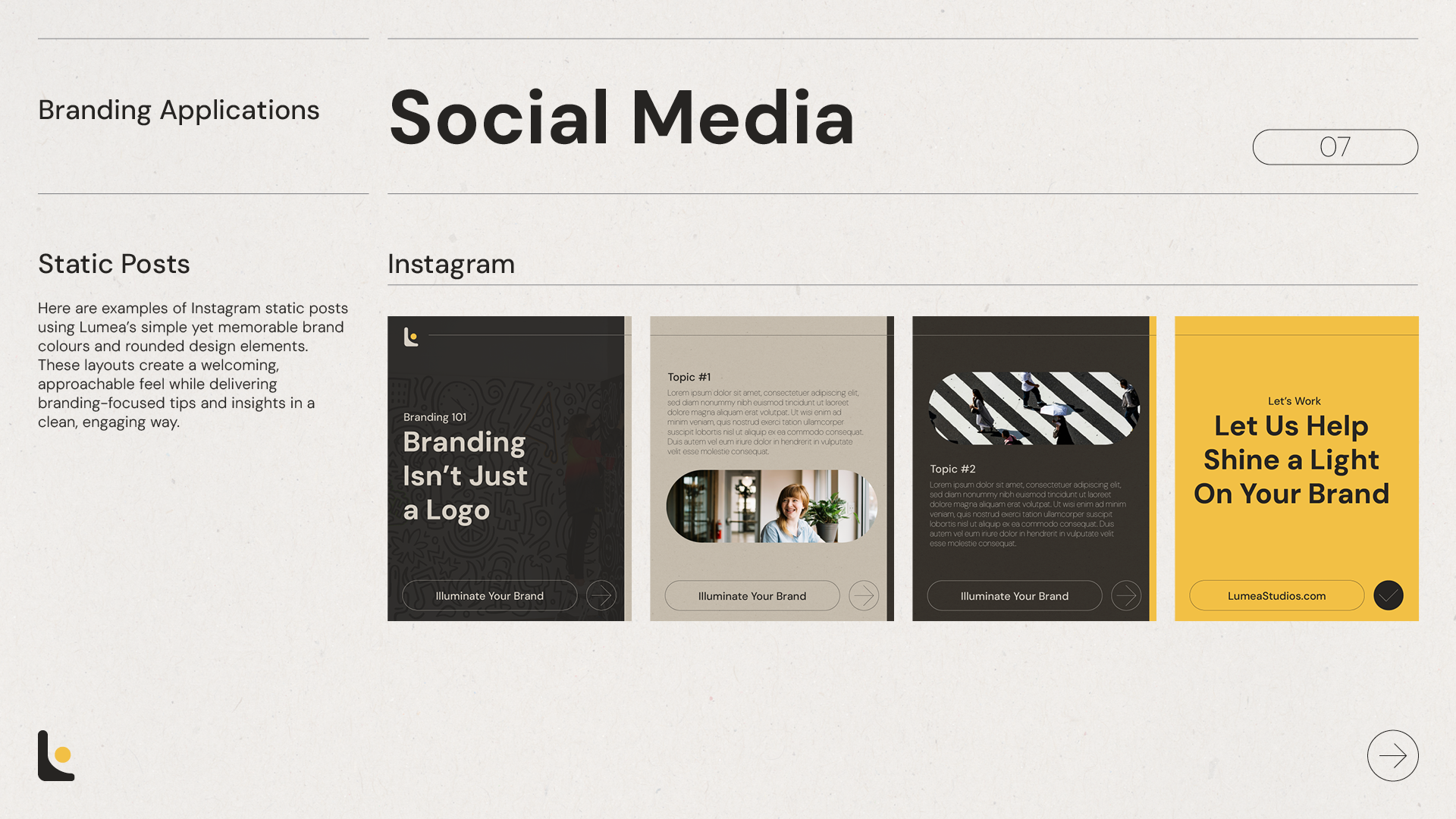
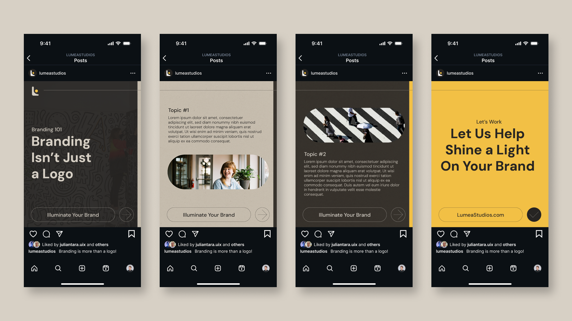
This project includes a brand guideline, with room to adapt and grow as the agency expands, motion graphic logo animations, and a set of Instagram static posts demonstrating real-world brand applications. Each deliverable showcases how the visual identity functions across digital touchpoints while maintaining consistency and clarity.
Animated Logo & Social Posts

Final Outcome & Impact
The final deliverables establish a clear and consistent visual identity that strengthens Lumea Studios’ presence across digital touchpoints. The brand guideline provides a structured foundation for future work, ensuring cohesive use of colour, typography, and visual elements. The logo animation adds movement and character, enhancing brand recognition and bringing the studio’s focus on illumination to life. The Instagram posts demonstrate how the identity translates into approachable, memorable content, supporting a strong and unified brand experience.
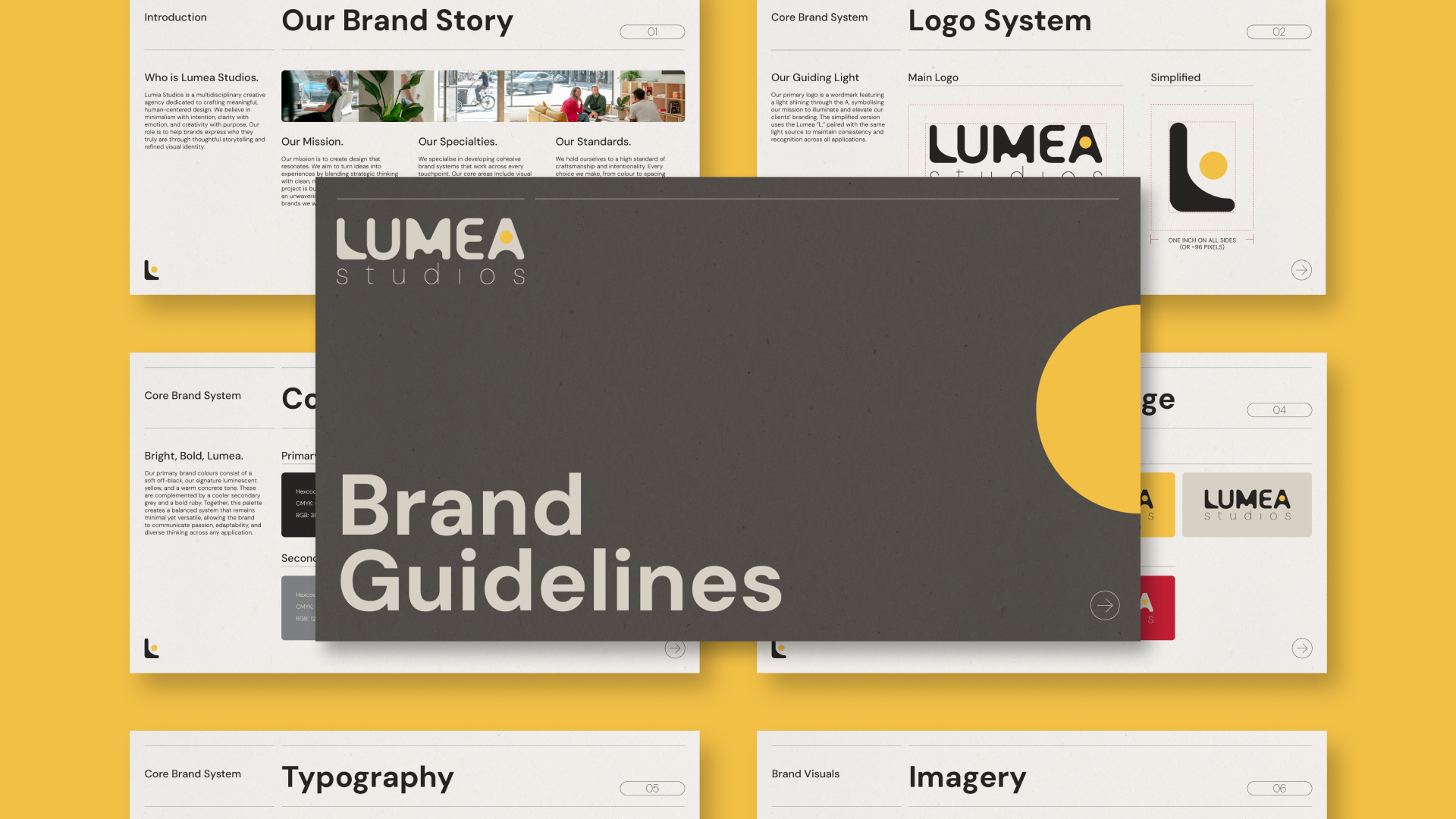
Full Brand Guidelines