Overview
TempFit was created in my Design Studio I class to address weather-related harm, a growing issue in cities like Calgary, where extreme temperatures pose risks, especially to elderly individuals and young children. Our goal was to design an app that helps users and caregivers stay prepared, reducing weather-related discomfort and health risks through personalised alerts, outfit recommendations, and real-time updates.
My Role
As Lead Creative & UX/UI Designer, I focused on:
• Structuring and designing key components.
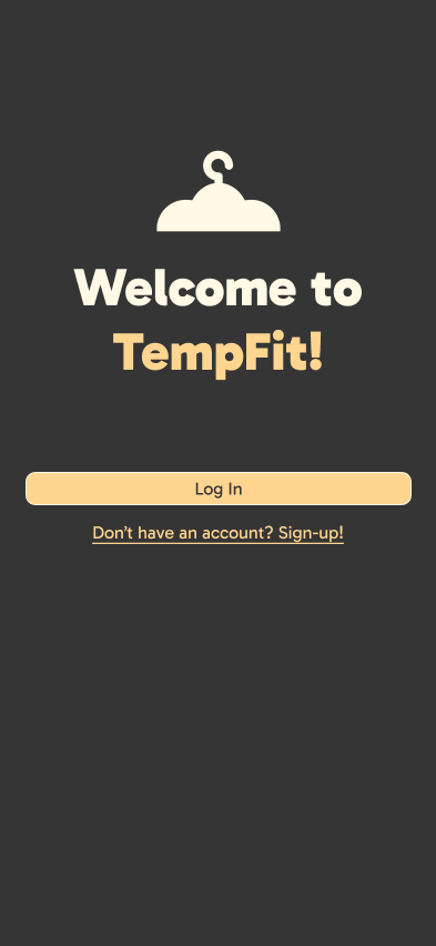
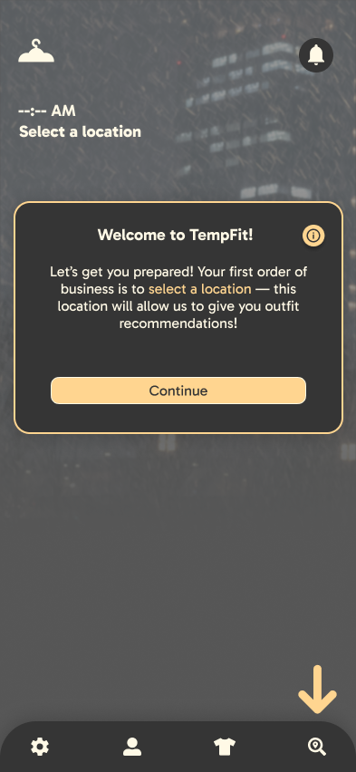
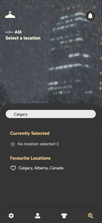
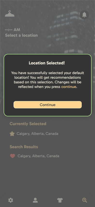
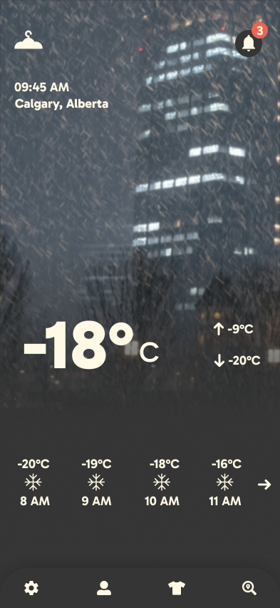
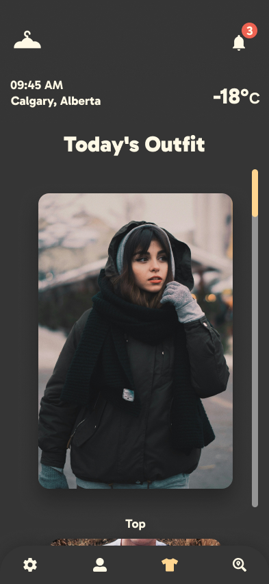
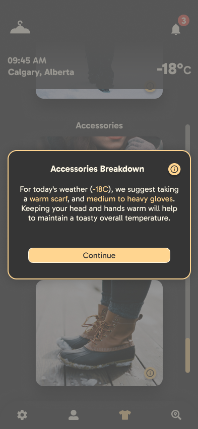
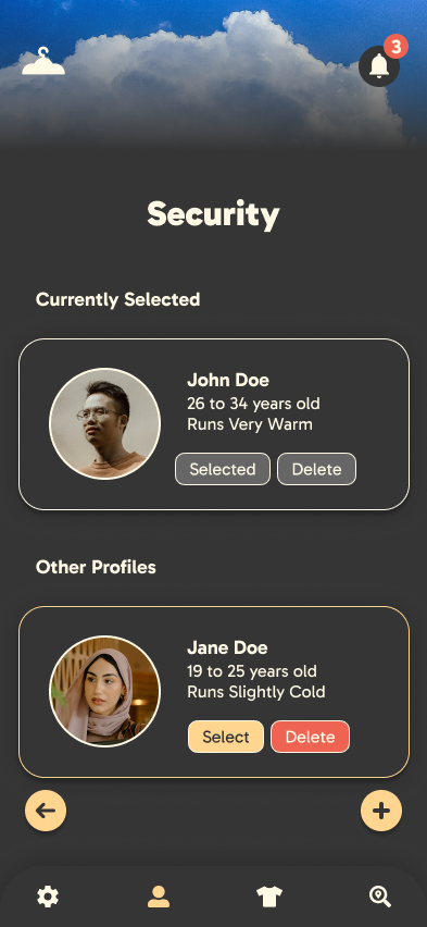
• Creating the brand identity & high-fidelity screens.
• Conducting qualitative & quantitative research for usability improvements.
Tools Used
• Figma/FigJam – User flows, wireframes, high-fidelity UI.
• Illustrator – Logo and branding elements.
• InDesign & Canva – Presentation & document templates.
• Trello – Task tracking and iterative design workflow.
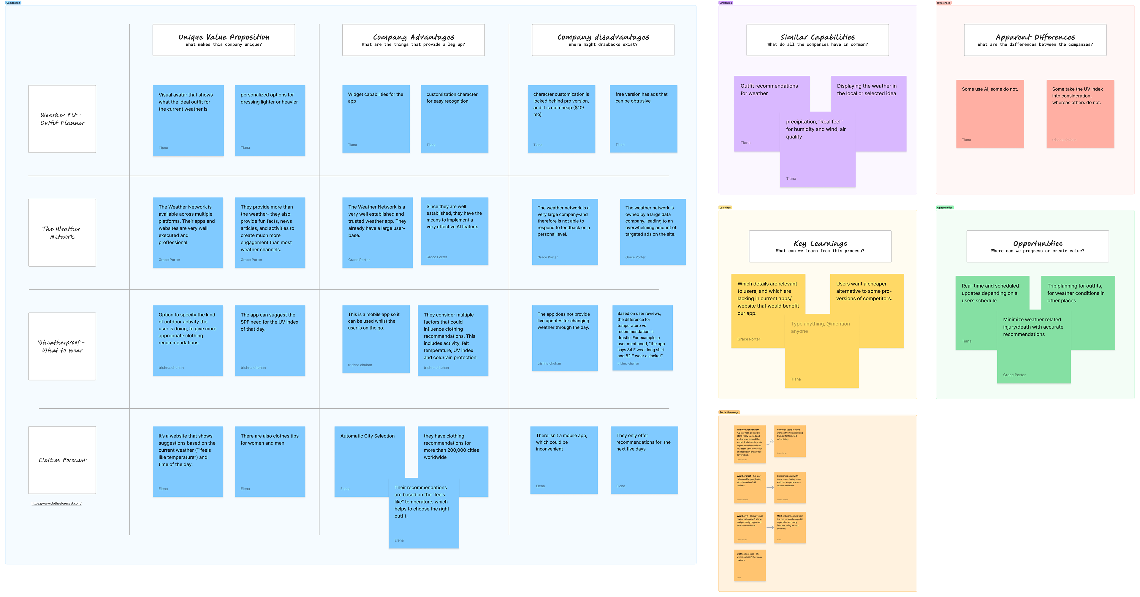
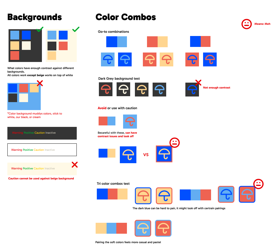
Competitive & SWOT Analysis, Colour Palette & User Flows

Research & Process
Our design process was feedback-driven and involved:
• Instructor Guidance & Structured Phases – Instructor feedback was integrated across four phases to ensure an iterative and well-structured design process.
• User Research & Competitive Analysis – Initial research was conducted to understand our target audiences, utilising competitive analysis, personas, and SWOT analysis to identify key opportunities and pain points.
• User Surveys & Validation – Both qualitative and quantitative user surveys were conducted to validate problem statements and refine feature sets based on real user input.
• Collaborative Branding Creation – The team worked together to establish a strong visual identity, aligning on typography, colour schemes, and design aesthetics to ensure consistency across all elements.
• Wireframing & Iterations – Based on our research findings, wireframes were developed to establish the structure and flow of key layouts. Multiple iterations were created and refined through continuous feedback.
• High-Fidelity Designs & Comprehensive Component Library – I created the components and overall design direction for the app, ensuring a cohesive experience across screens. Additionally, I designed the logo, reinforcing brand identity.
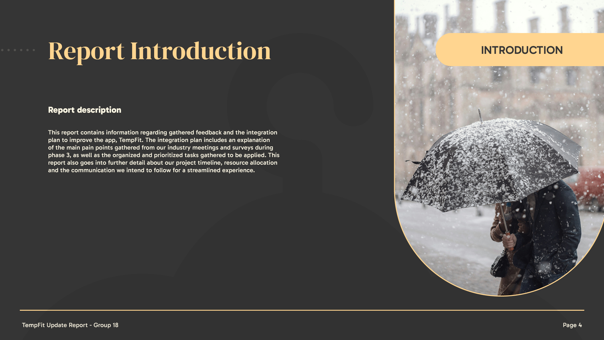
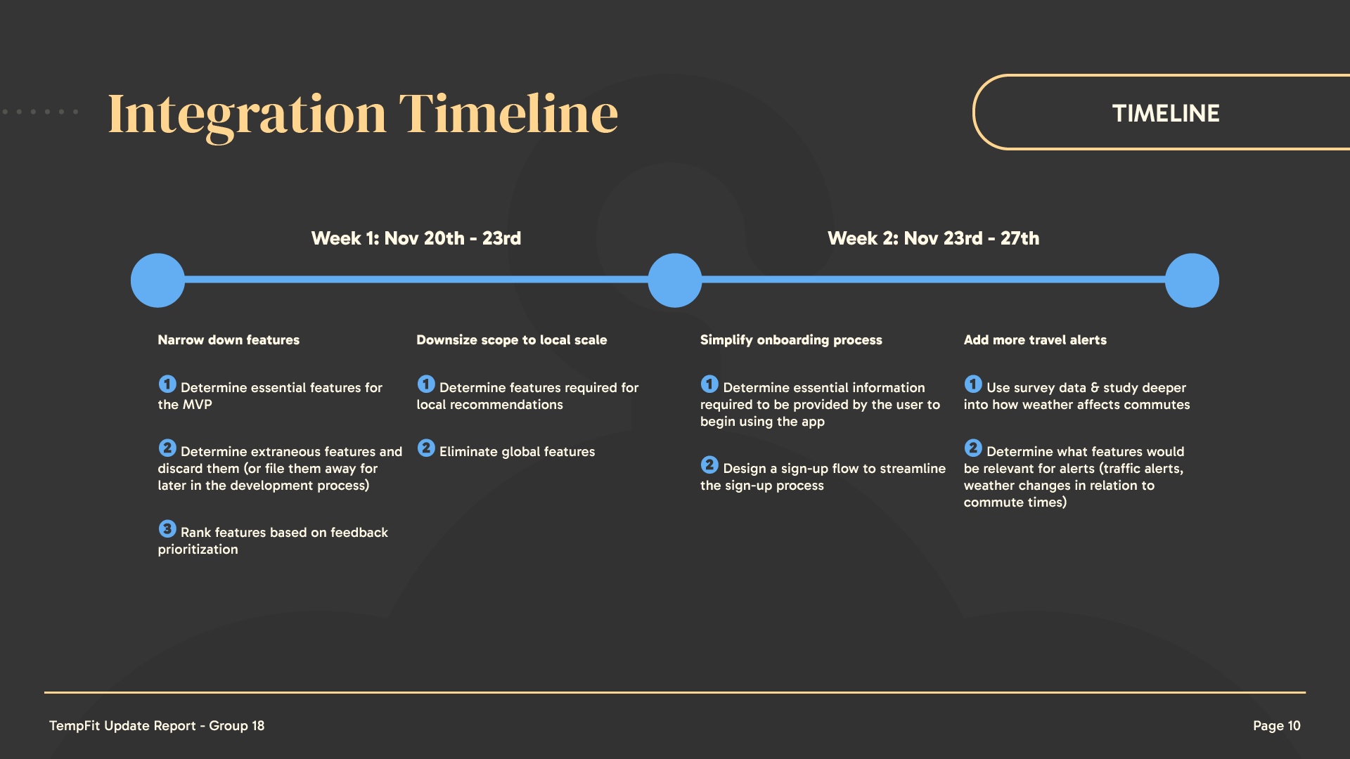
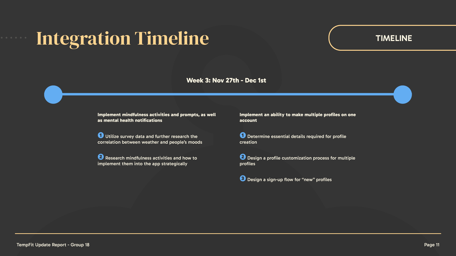
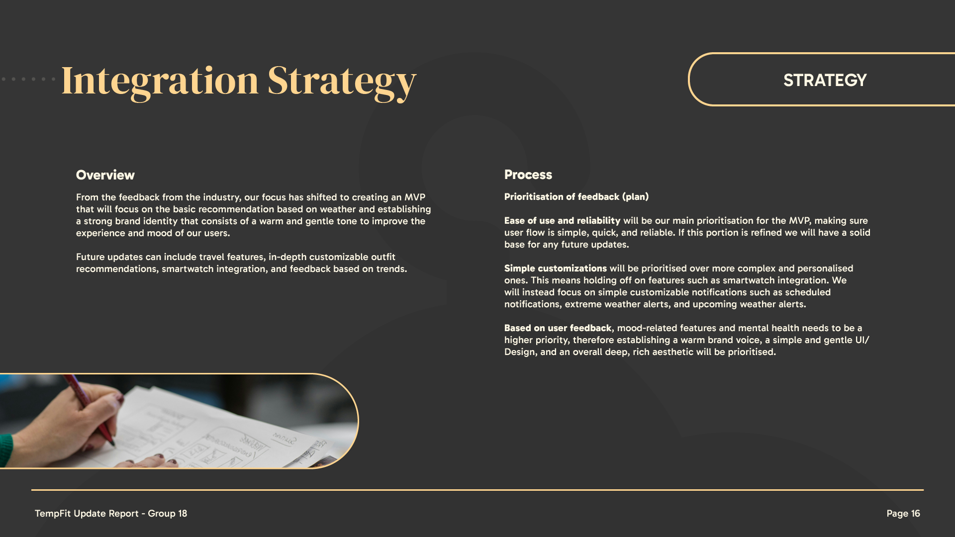
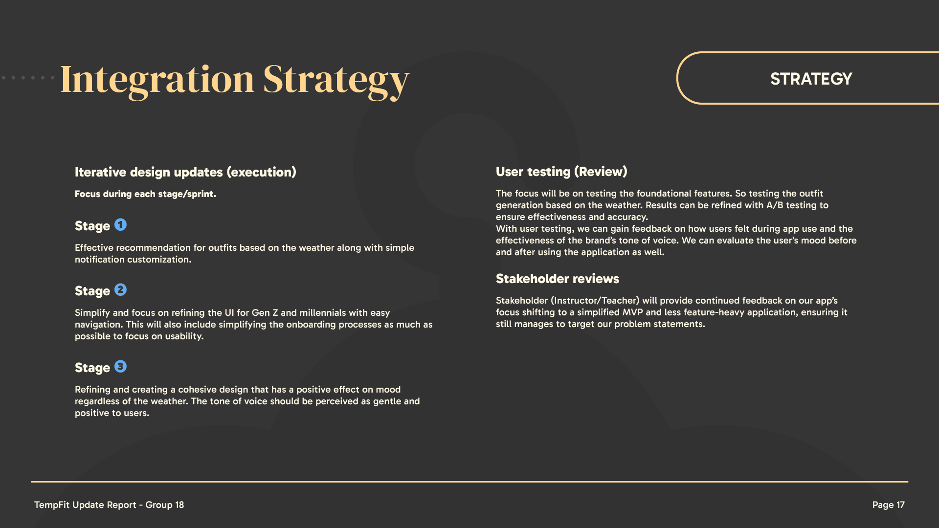
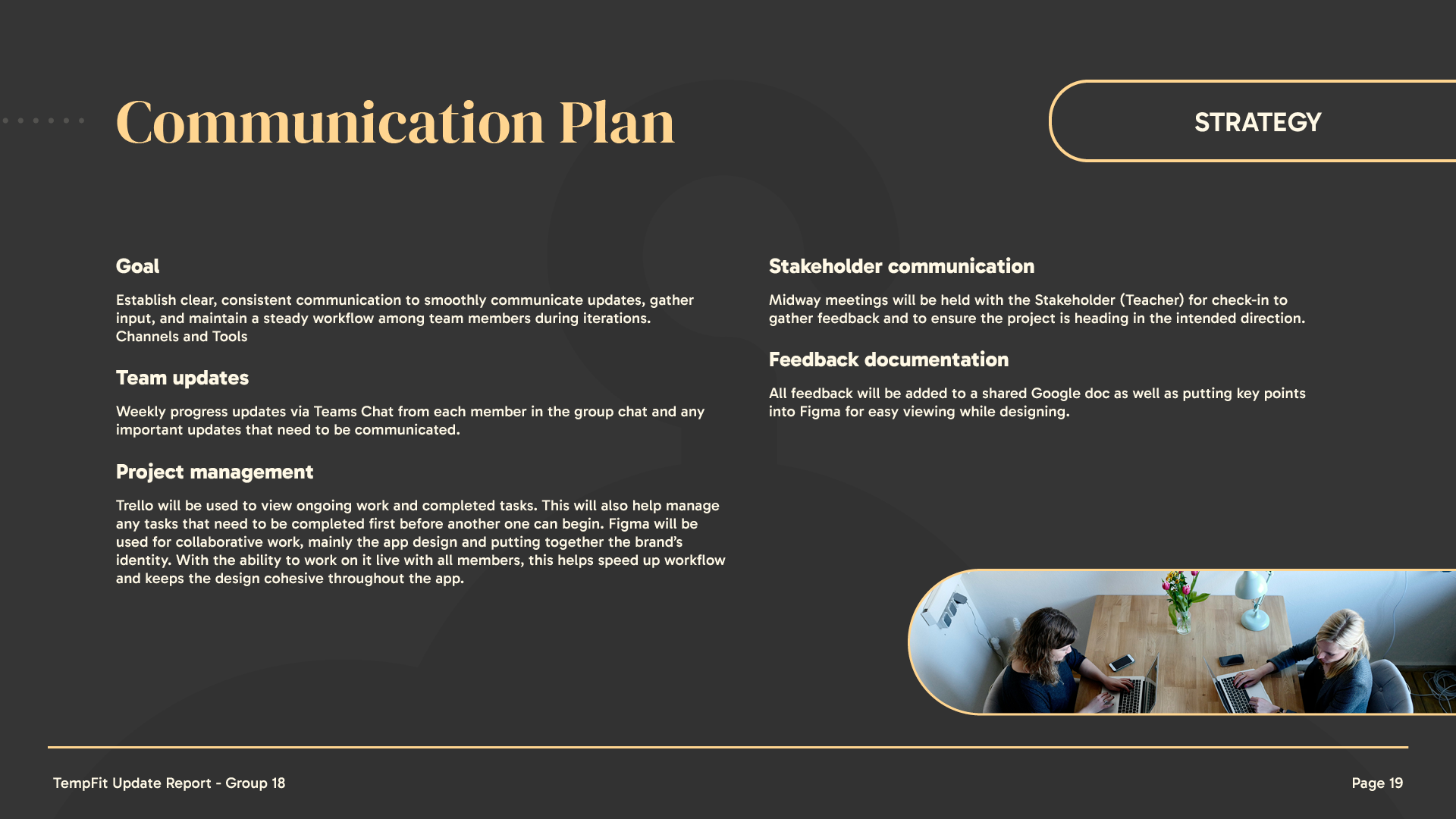
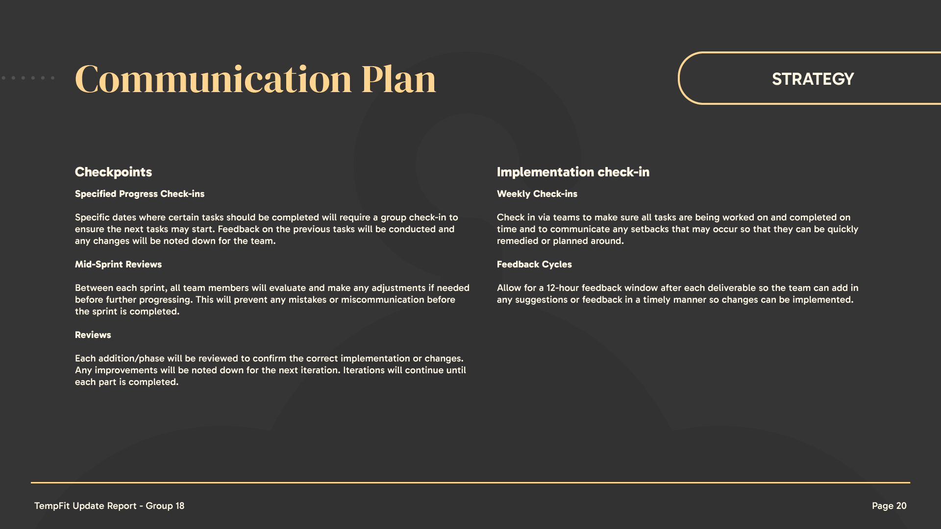
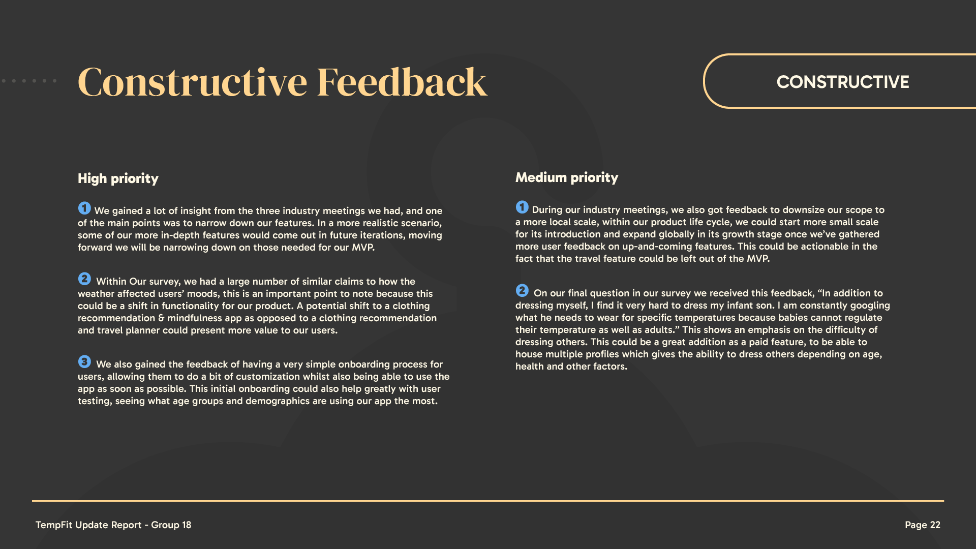
• Iterative Feedback & Presentations – At each phase, we presented our findings and designs to gather additional feedback before finalizing decisions. Creating an update report to plan out implementation.
• Industry Professional Insights – Expert feedback was gathered during project pitch sessions, providing valuable industry perspectives to enhance the final product.
Key Features
• Current Weather – Real-time weather display of selected location.
• Custom alerts – Customizable alerts to fit any user's schedule.
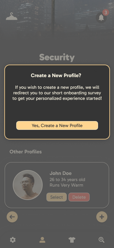
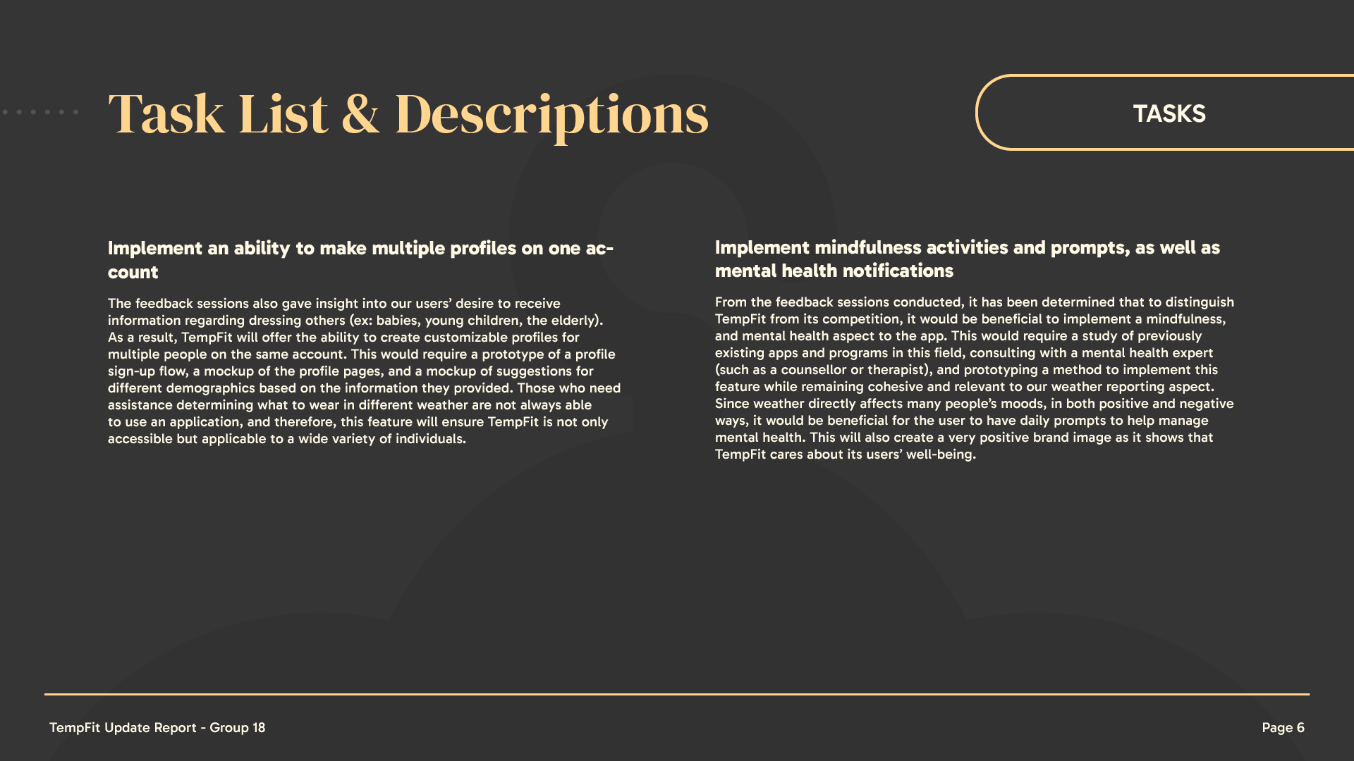
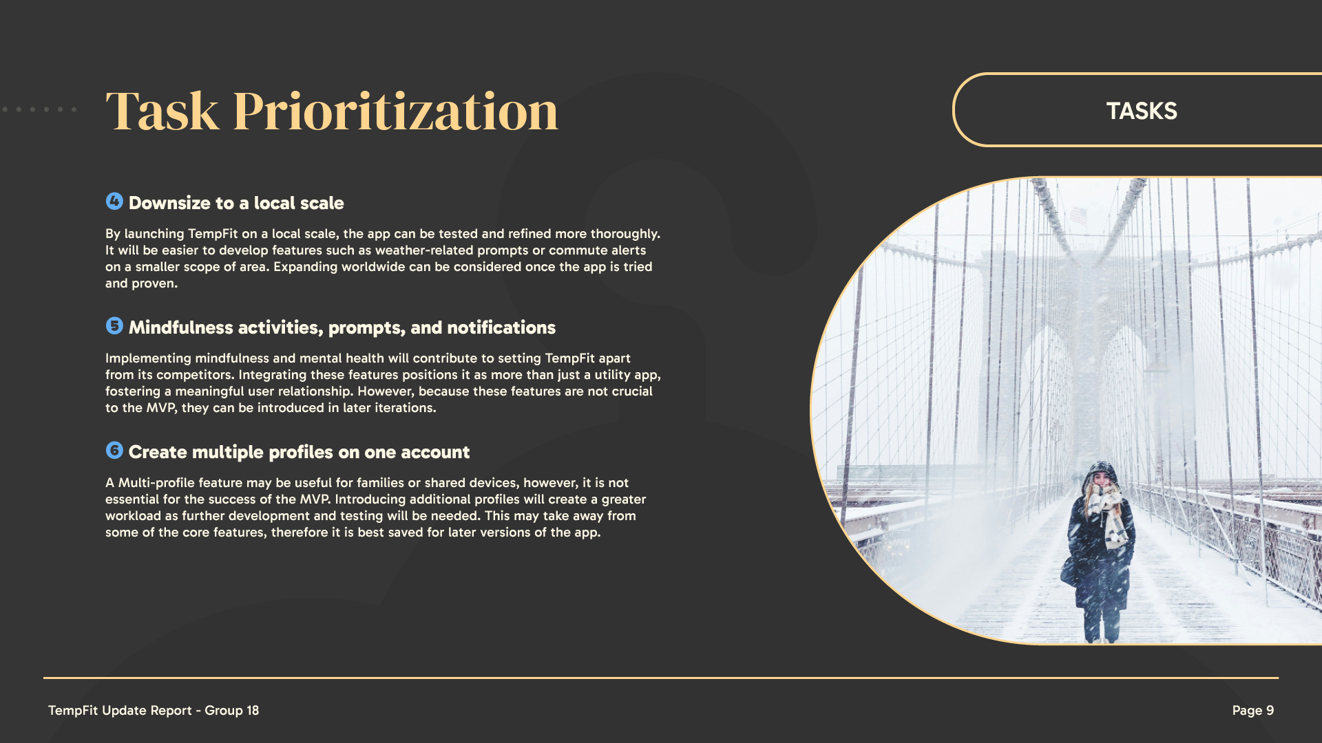
• Profile Selection – Multiple profile creation for personalised needs and recommendations.
• Outfit Creation – Outfit recommendation system for the selected location.
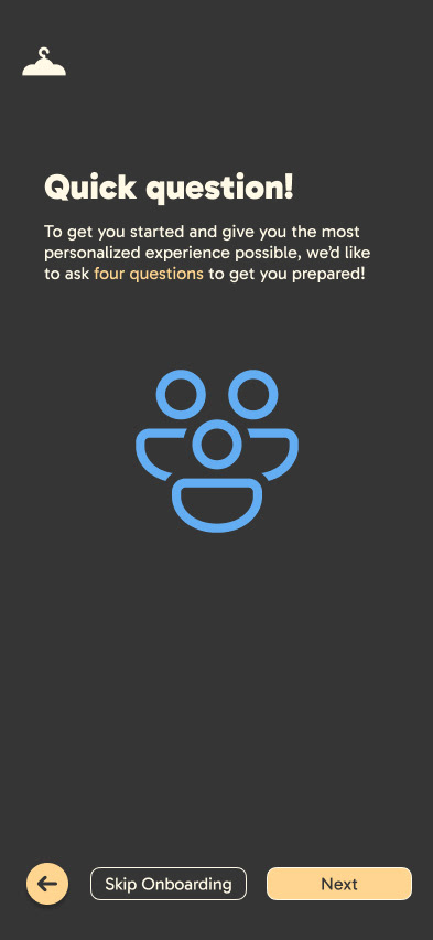
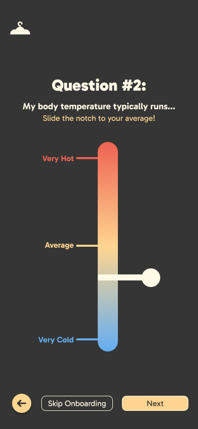
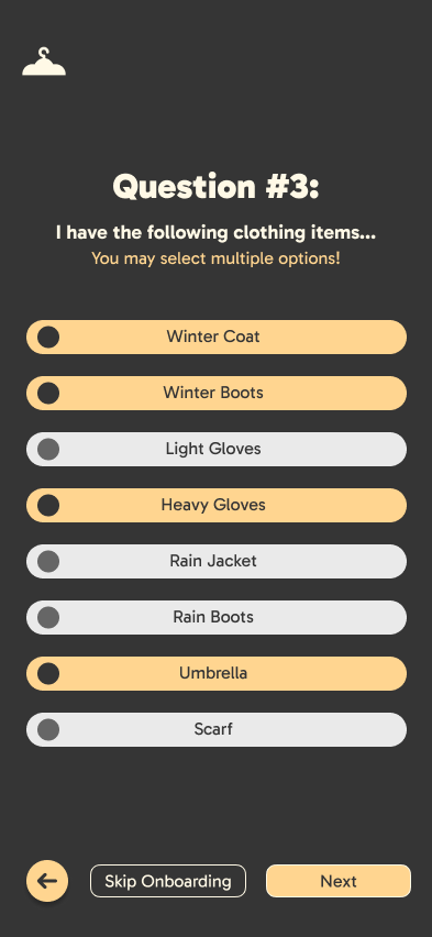
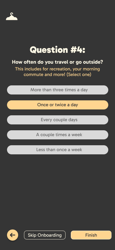
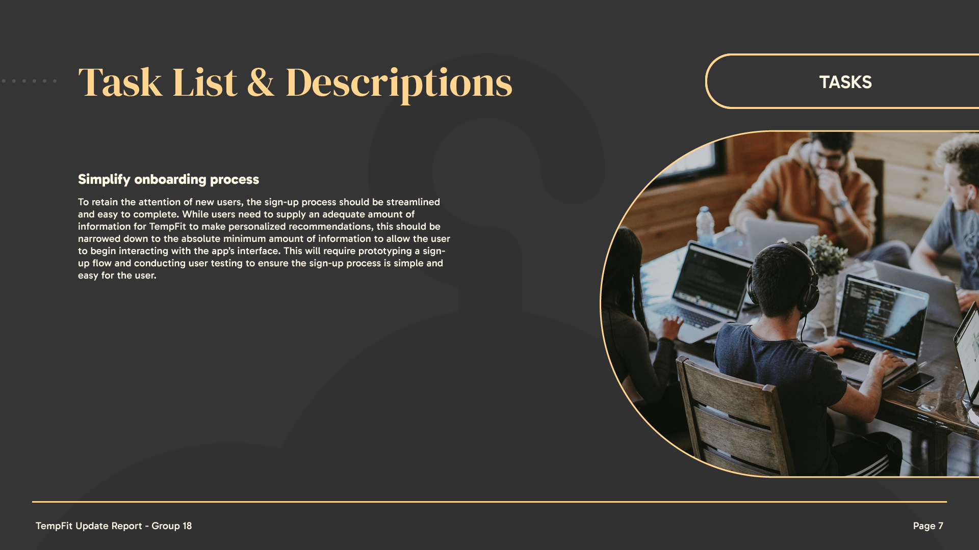
• Personalisation – Short onboarding sign-up experience to create personalised accounts
Potential Iterations & Features
• Medical Onboarding – more personalisation around health-related customisations (anaemia, diabetes and other illnesses and conditions)
• Longer Term Planning – Adding a travel planner to plan longer periods instead of only day-to-day outfits.
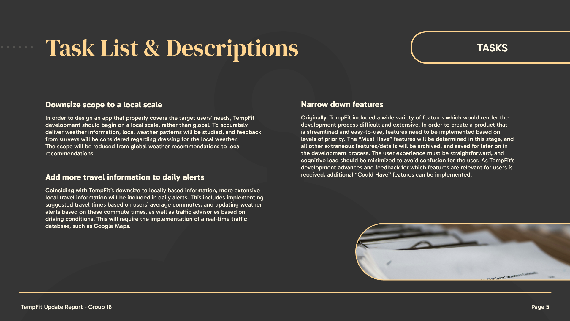
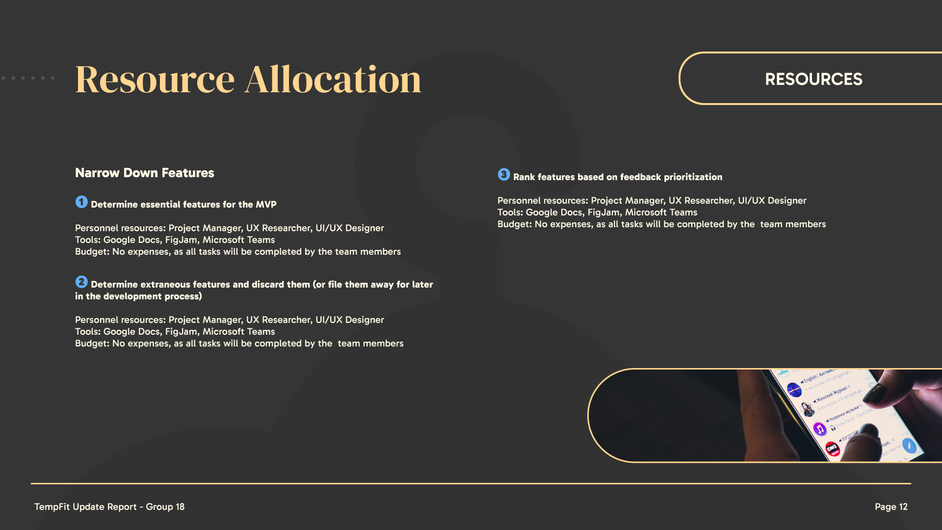
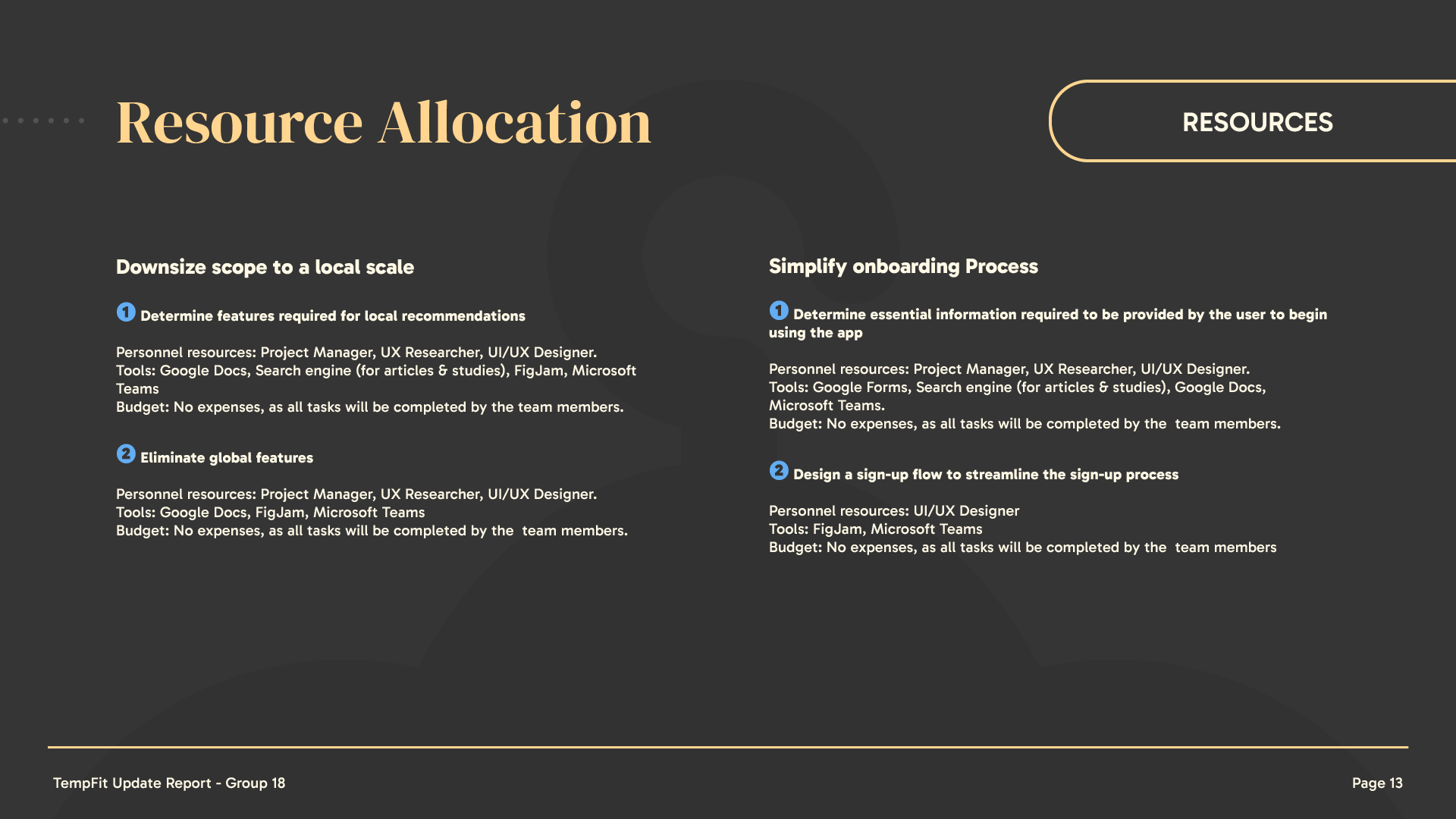
Update Report - Integrating Feedback






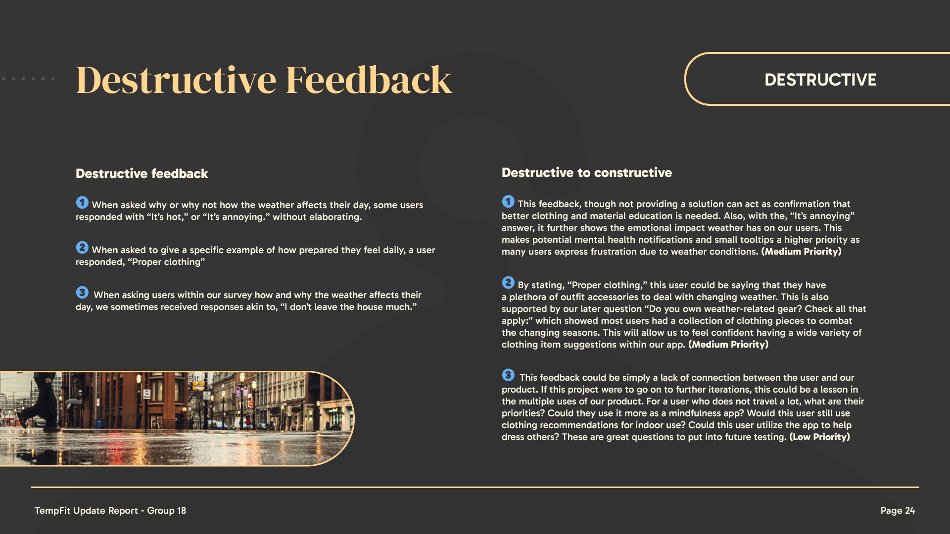
Challenges & Pain Points
• Balancing Aesthetic & Functionality – As we were creating the branding and interface for this application, there needed to be a good balance between visually pleasing design and easily-usable features.
• Wide Target Audience – Designing for both elderly users and young children while keeping the interface intuitive and accessible.
• Feature Scope Management – Narrowing down our initial MVP feature list to focus on the most essential functionalities without overcomplicating the experience.
Learnings & Improvements
• User-Centred Design Thinking – Designing for diverse user needs reinforced the importance of validating assumptions through research and testing, this helped to shape our branding and creating concise user flows.
• Leadership & Collaboration – Taking on a leadership role helped me manage feedback, balance team input, and refine my decision-making process.
• Scope & Prioritization – Navigating feature creep and refining the MVP scope taught me how to focus on essential functionalities for a streamlined user experience.

Final Outcome & Impact
This project resulted in a collection of high-fidelity screens and a cohesive brand identity, ensuring visual consistency and a polished presentation of the app’s core features.
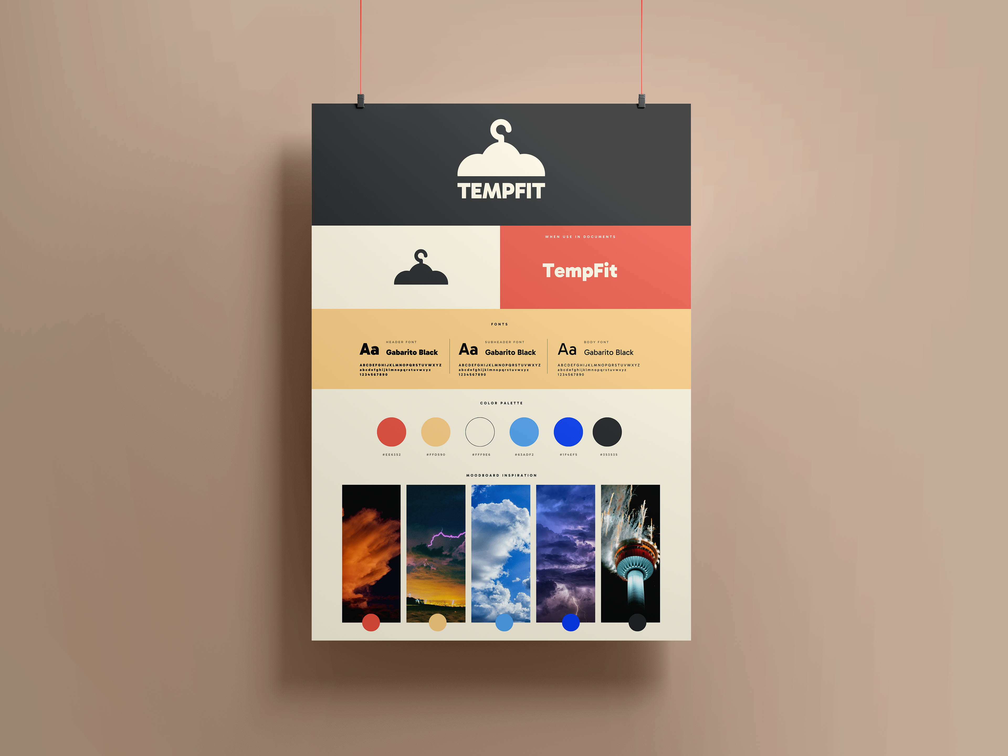
• Consistent Branding – Developed a unified visual identity, including a refined logo, colour palette, typography, and UI components, maintaining design consistency across all deliverables.
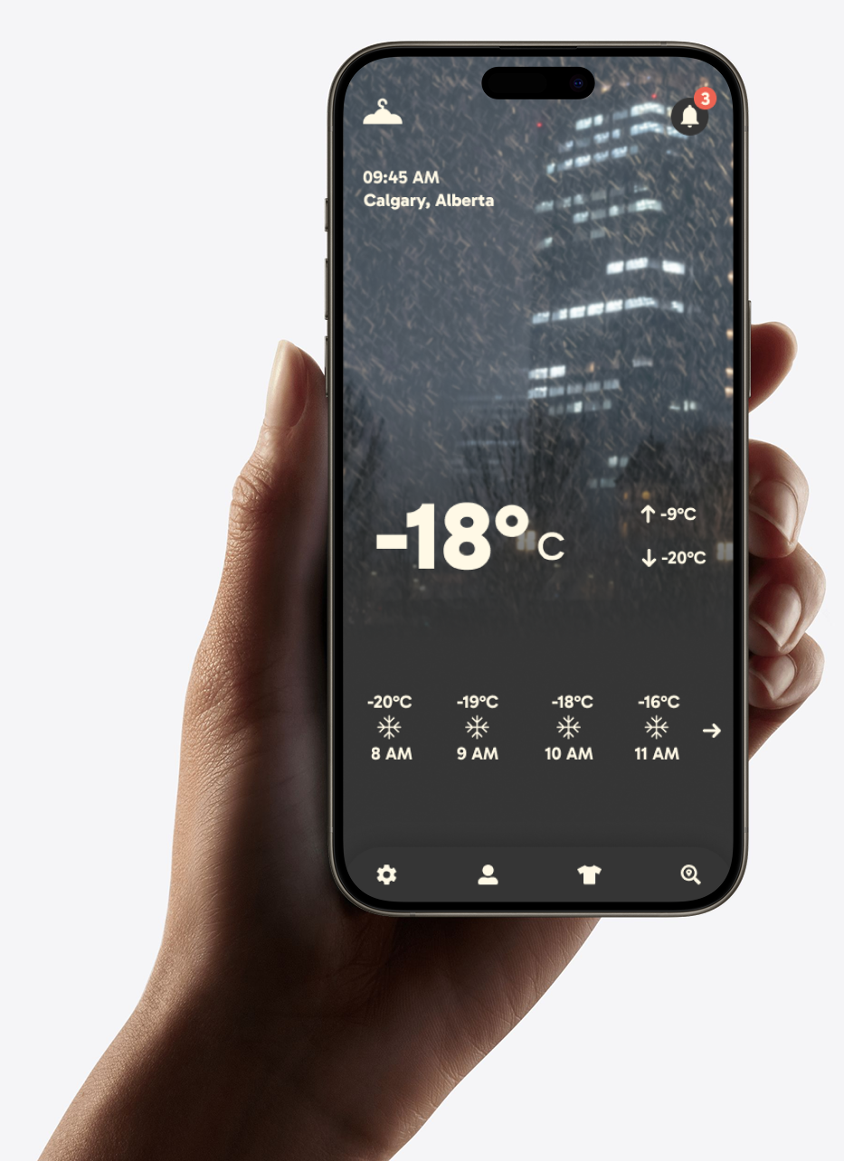
• High-Fidelity Screens – Designed detailed app screens that effectively showcased the app’s core functionality and visual direction, helping to communicate the user experience.
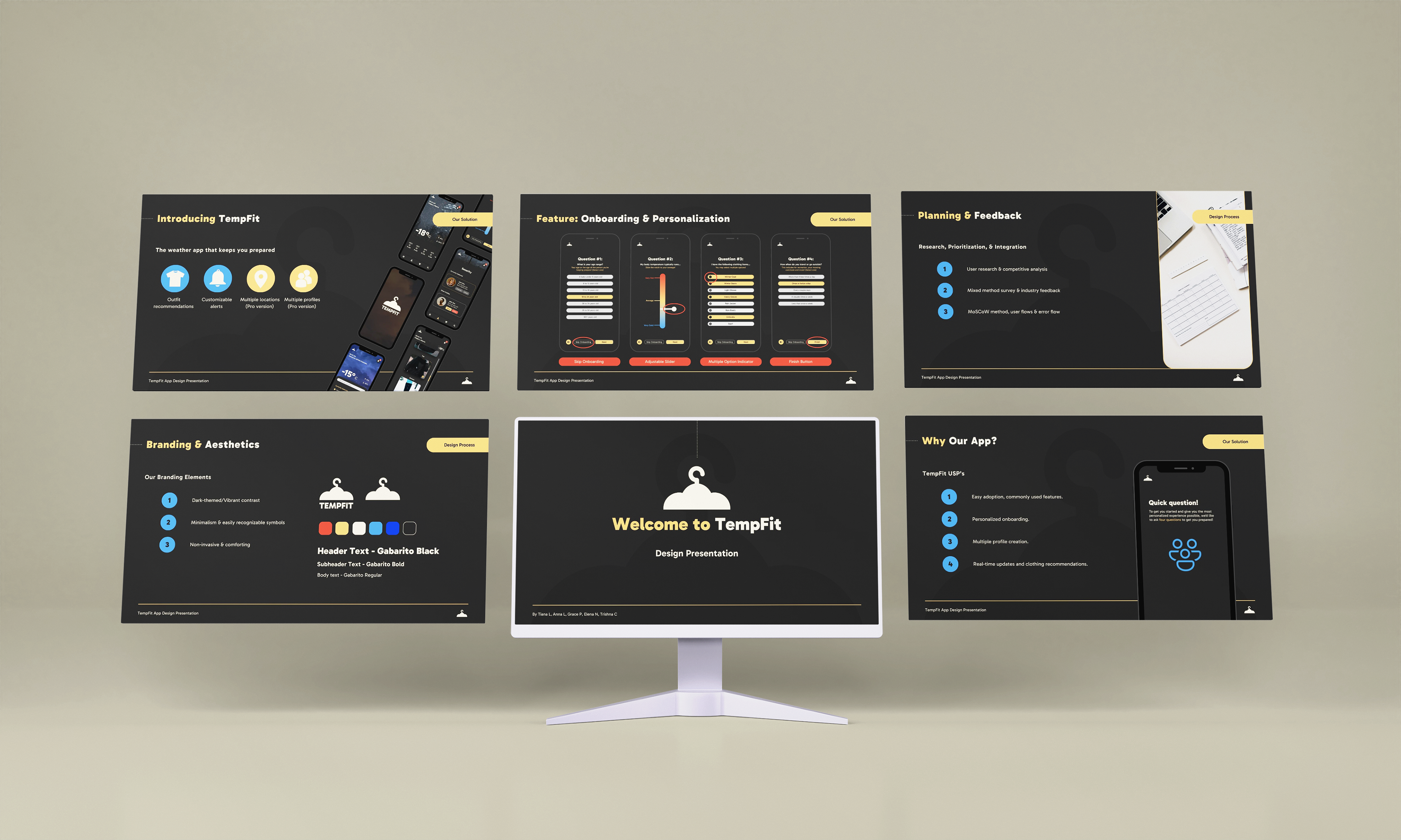
• Final Presentation & Document Design – Created structured presentation templates and branded documents, ensuring professionalism and clarity for stakeholder review.
High-Fidelity Screens
