

Overview
Pawsitive Match Rescue Foundation is a non-profit animal shelter dedicated to rescuing animals from kill shelters, providing foster homes, and hosting adoption events in Calgary. They sought a modernised website to better showcase their mission and impact while ensuring essential information was easily accessible for volunteers and adoptees.

My Role
As the UX/UI Designer, I focused on:
• Performed user research and analysed project constraints.
• Created page layouts for web & mobile versions.
• Structuring and designing high-fidelity components & prototypes.
• Maintaining the brand identity & high-fidelity prototype of both web and mobile versions.
• As the main point of contact, I conducted regular feedback sessions with the stakeholders to align with business goals and user needs.
Tools Used
• Figma/FigJam – User flows, wireframes, high-fidelity UI & prototyping.
• Trello – Task tracking and iterative design workflow.
• Microsoft Suite – Excel and Word for the site map and research collection.
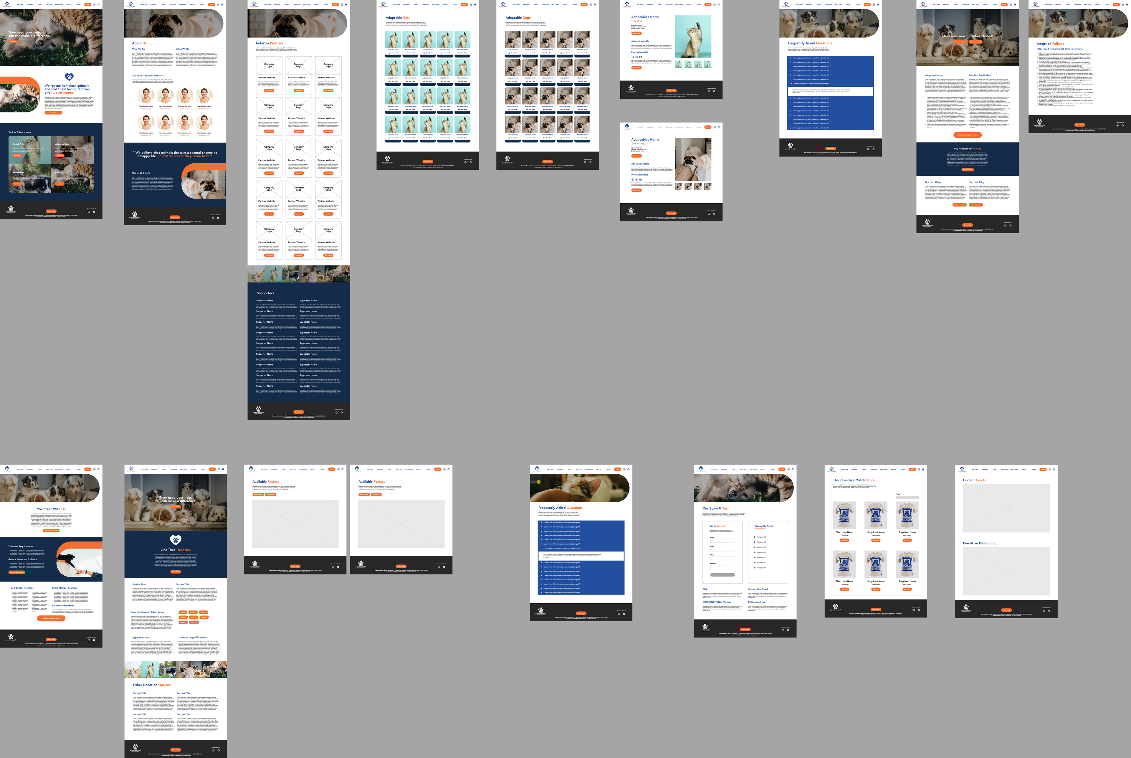
Wireframes to High-Fidelity Prototype

Research & Process
Our design process was feedback-driven and involved:
• Initial Inspiration & Stakeholder Input – We began by gathering inspiration based on our stakeholders’ preferences and collecting in-depth feedback to guide the design direction.
• User Research & Target Audience Considerations – Additional research was conducted to identify themes that resonate with younger audiences, as our client wanted a website that would appeal to teens and young adults.
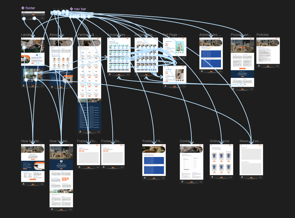
• Wireframing & Structure Planning – Once all necessary pages were mapped out in an Excel sheet, wireframes were created for key layouts and repeated page structures.
• Consistency in Design – I developed a wireframing kit and grid system to ensure uniformity across all pages and allow for easy adjustments.
• Feedback & Iteration – We collected feedback at multiple stages, refining the design before moving on to high-fidelity components.
• High-Fidelity Design & Prototyping – After finalising wireframes, high-fidelity components were created, followed by interactive prototyping.
• Final Handoff – Once all feedback and iterations were completed, the prototype was handed off to the development team for implementation.
Key Features
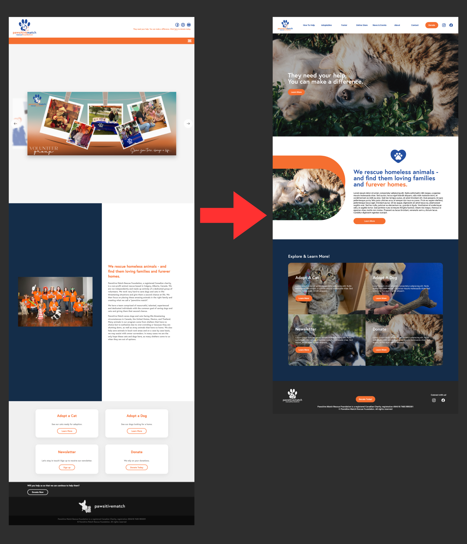
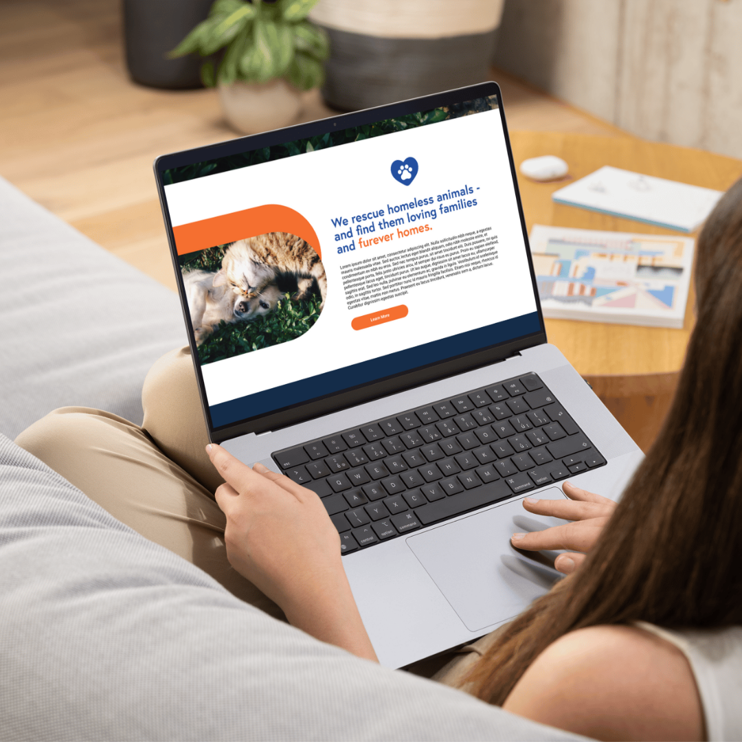
• Shifted Colour Usage – Simplified colour scheme, utilizing the Pawsitve match royal and navy blue for better contrast and visual interest.
• Rounded Elements – Softly rounded corners on elements and cards to maintain a friendly appeal while maintaining a minimalistic, modern feel.
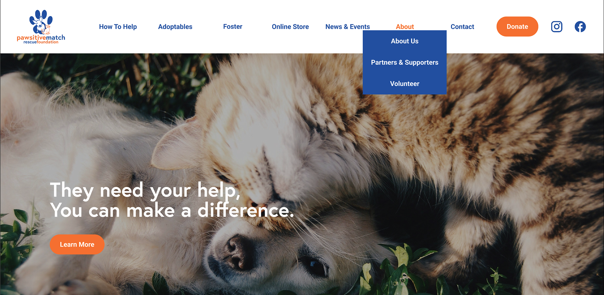
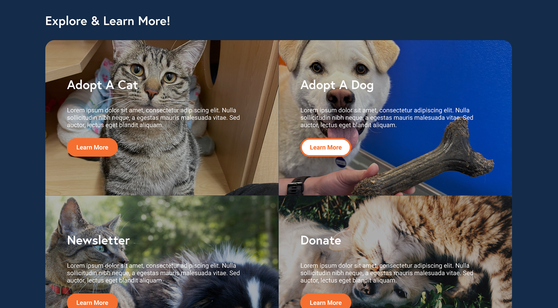
• Condensed Navigation – Maintaining the important information while combining relevant copy and sections, streamlining the viewing experience for users.
• Hover Effects – for buttons and cards to maintain readability while easily guiding the user through the necessary information.
Potential Iterations/Features
• Working directly with Devs - I would have loved to work side by side with their dev to maintain as close to the design as possible, but that wasn't an option for this project. This was still a valuable opportunity to refine my research process and make sure my designs were within the capabilities of their chosen web builder (WebFlow).
Challenges & Pain Points
• Information Packed – Because there were a multitude of sections with need-to-know information for volunteers, foster homes and potential adoptees, we needed to maintain clarity while ensuring readability and ease of navigation.
• Balancing Goals vs. Needs – While the stakeholder had the final say, I ensured that clear, descriptive explanations backed all design choices. This helped align business goals with user needs while maintaining design integrity.
• Keeping Devs in Mind – Since I was not working directly with the developer, I designed with development feasibility in mind, ensuring the project aligned with their web builder of choice (Webflow) and its technical limitations.
Learnings & Improvements
• Condensed Sections – Working together with the client, we condensed some sections, combining pages to create cohesive sections with all necessary information, whilst streamlining the user journey for a smoother experience.
• Strategic Colour Usage – We wanted to ensure the new website had a refreshed look while still staying true to the Pawsitive Match brand. We utilised the current brand colours in colour-blocked sections to help break up lengthy pages and add visual interest. Focusing more on the navy blue with orange accents, keeping the website recognisable to users.
• Button Refinement – To allow CTA's to stand out more, the look was shifted in tandem with the shifted brand colour focus. Having the buttons in the bright Pawsitive Match orange allows for ample visibility and optimal contrast against navy, white and imagery-focused background!
Final Outcome & Impact
The redesign provided a more intuitive, user-friendly experience for volunteers and adopters, improving accessibility and usability for key audiences.
• User-Centred Website Design – Improved navigation and accessibility to ensure a seamless experience for users seeking adoption and volunteer opportunities.
• Refined Information Architecture – Reorganised key sections to make critical information easier to find, reducing friction in the adoption process.
• High-Fidelity Wireframes & Prototype – Developed an interactive prototype in Figma to communicate design decisions effectively with stakeholders and developers.
• Consistent Branding & Visuals – Established a refreshed, welcoming visual identity, reinforcing trust and engagement with potential adopters and donors.
Mobile Prototype
Desktop Prototype