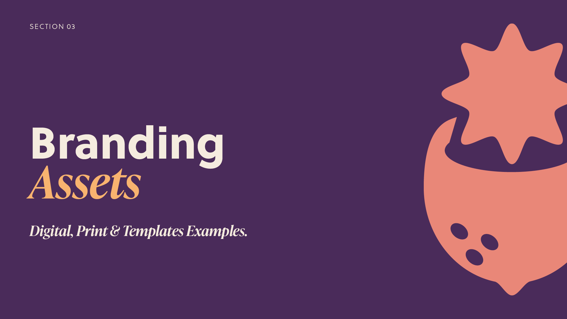
Overview
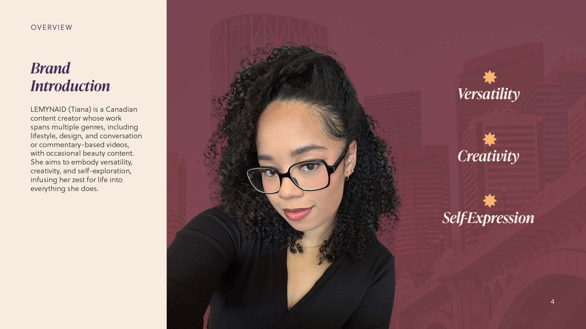
LEMYNAID is my personal brand, and it is currently rebranding to reflect better my evolving identity and creative direction. The primary goal was to move away from aesthetics that felt overly trendy or restrictive, in favour of a more holistic and versatile visual identity, one that represents my full range of interests, creativity, and self-expression. This revamp supports a broader content focus, allowing the brand to move fluidly across genres. Previously, LEMYNAID was heavily centred around gaming, which was reflected in both the visual and tonal elements of the original branding.

My Role
As Lead Creative & Graphic Designer, I focused on:
• Compiling and refining core brand assets to strengthen visual consistency.
• Developing a cohesive and intentional brand guideline.
• Applying the refreshed brand identity across multiple channels and formats.
• Gathering feedback from trusted peers and iterating based on how the aesthetic reflected the creator’s personality and intent.
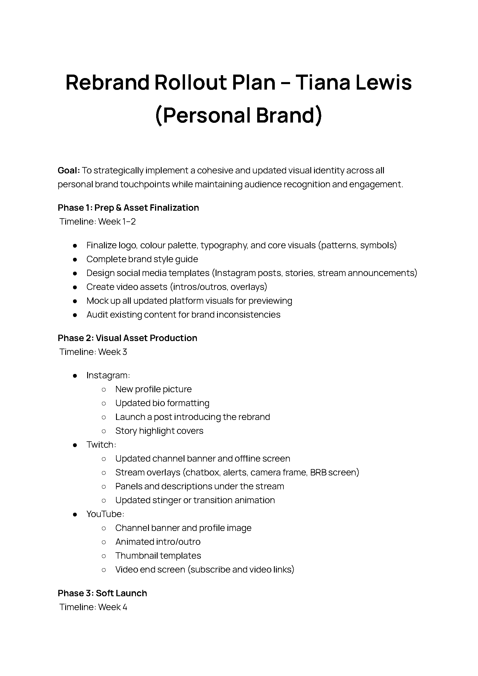
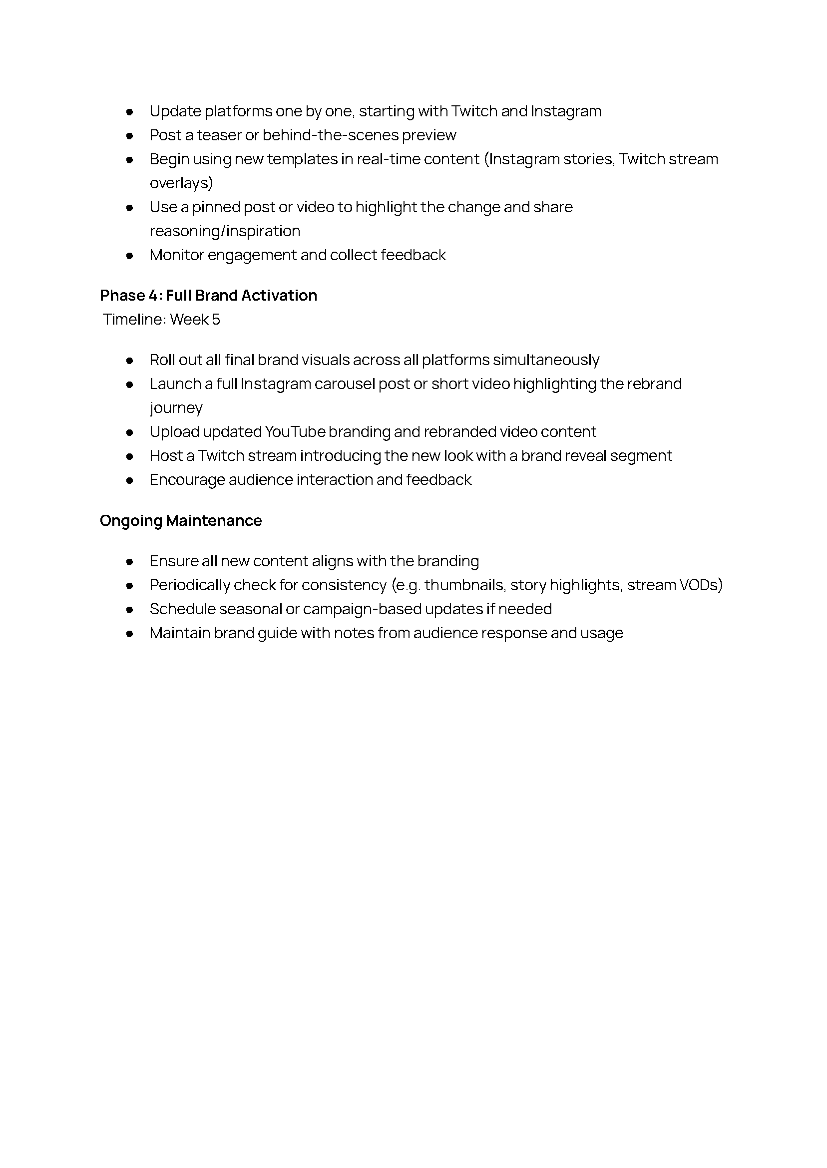
• Creating an implementation plan for a smooth, phased rollout of the rebrand.
Tools Used
• Illustrator – Logo design, branding elements, and reusable brand assets such as symbols and social media graphics.
• InDesign – Brand style guide, Presentation design, and print-related assets.
• Photoshop & Canva – Creating mockups for merch and photo elements.
• Trello – Task tracking and iterative design workflow.
• Figjam/Figma - Planning, inspiration gathering and organisation.
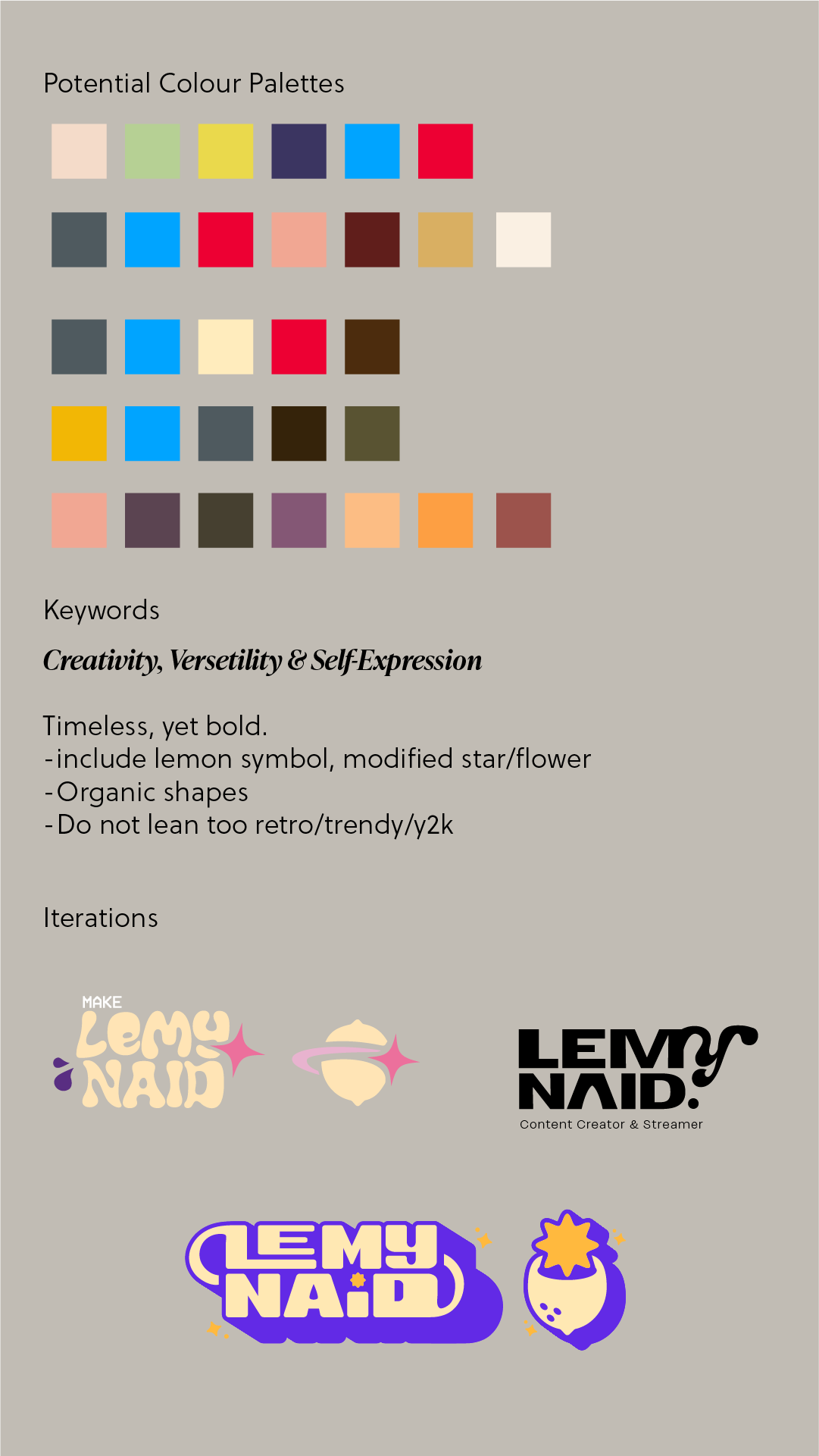
Colour Palette Ideation & Initial Rollout Plan

Research & Process
My design process was feedback-driven and involved:
• Initial Ideation – Identifying core keywords, visual themes, and overall goals for the rebrand.
• Project Planning & Workflow – Outlining key deliverables across all platforms to ensure a holistic and cohesive brand presence.
• Brand Guideline Development – Compiling finalised assets and refining design decisions into a structured brand guideline and accompanying copy.
• Feedback & Iteration – Seeking input from trusted peers to ensure the brand felt authentic to the creator’s voice and aligned with future initiatives.
• Rollout Planning – Defining milestones and adjusting timelines as needed for a smooth and intentional launch.
• Implementation – Currently in progress.
Key Features
• Identity Refinement – A refreshed and consistent brand identity designed for application across multiple platforms and content types.
• Brand Guideline – A comprehensive brand guideline outlining key visual elements, design intentions, and practical usage instructions.
• Brand Refresh – Updated visuals focused on a more timeless and simplified aesthetic, while highlighting versatility and creative flexibility.
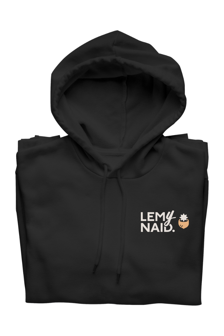
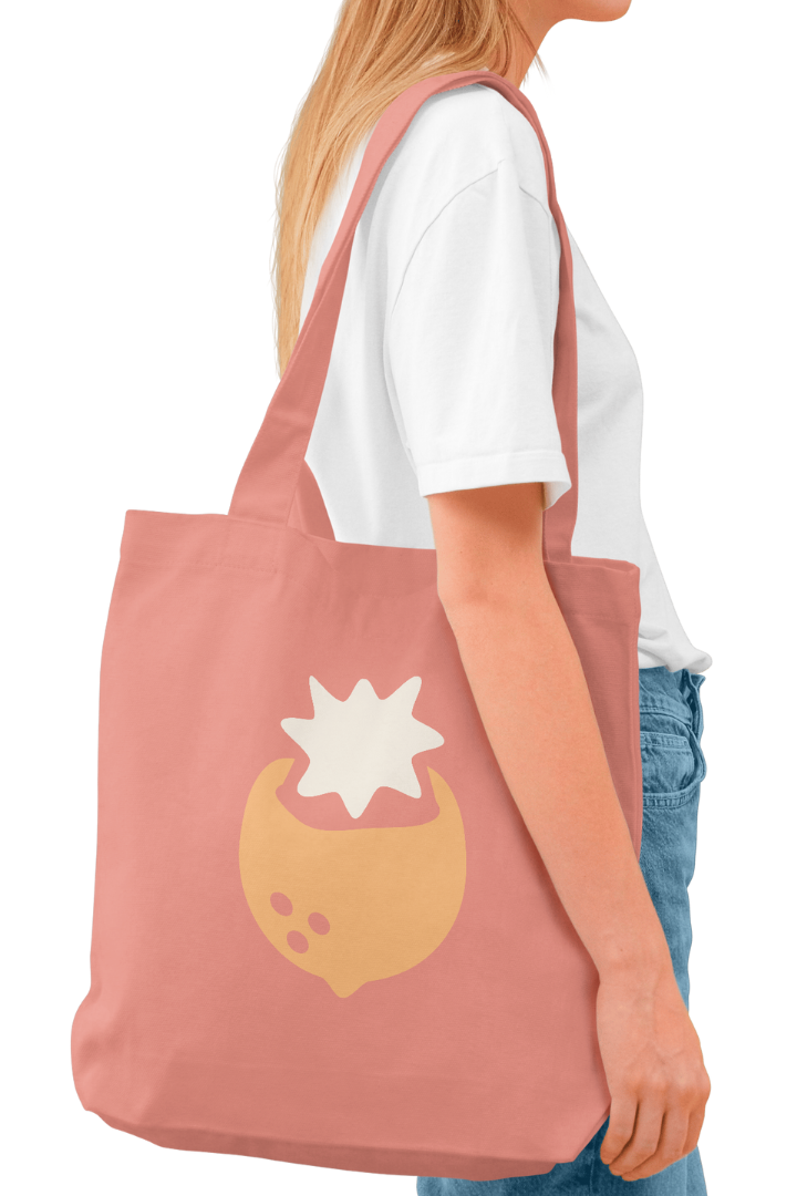
• Print Mockups – Merchandise mockups showcasing potential real-world applications and brand expansion opportunities
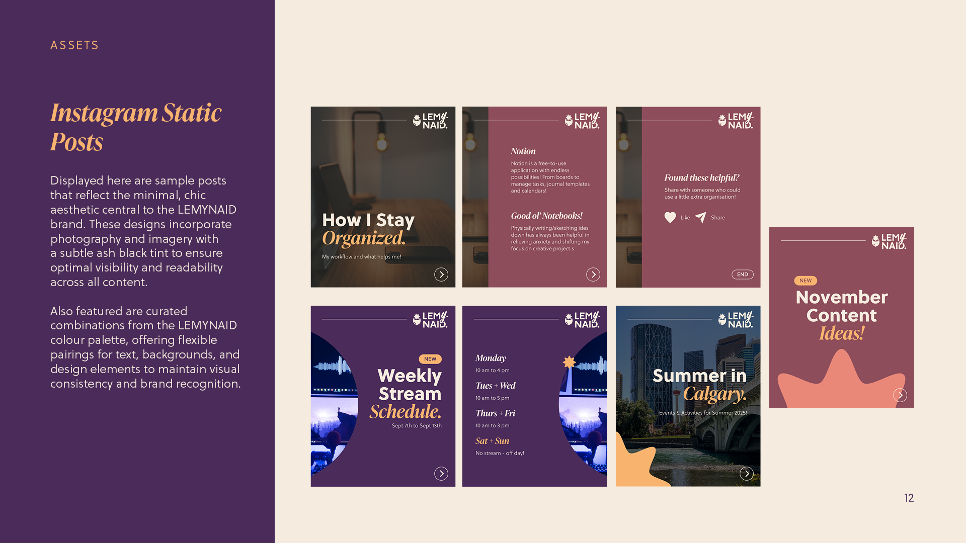
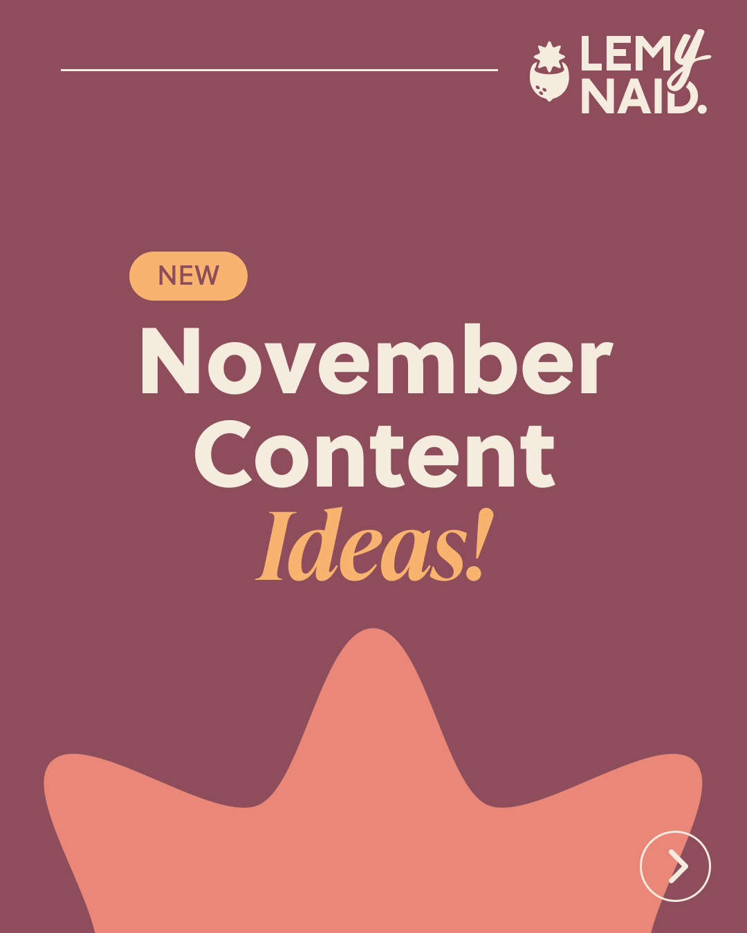
• Asset Library – A suite of reusable digital assets, including custom symbols, social media templates, and layout systems to maintain cohesion.
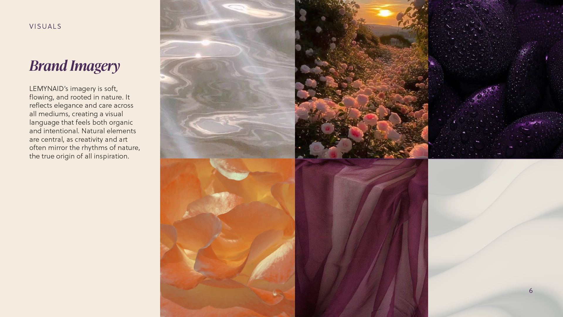
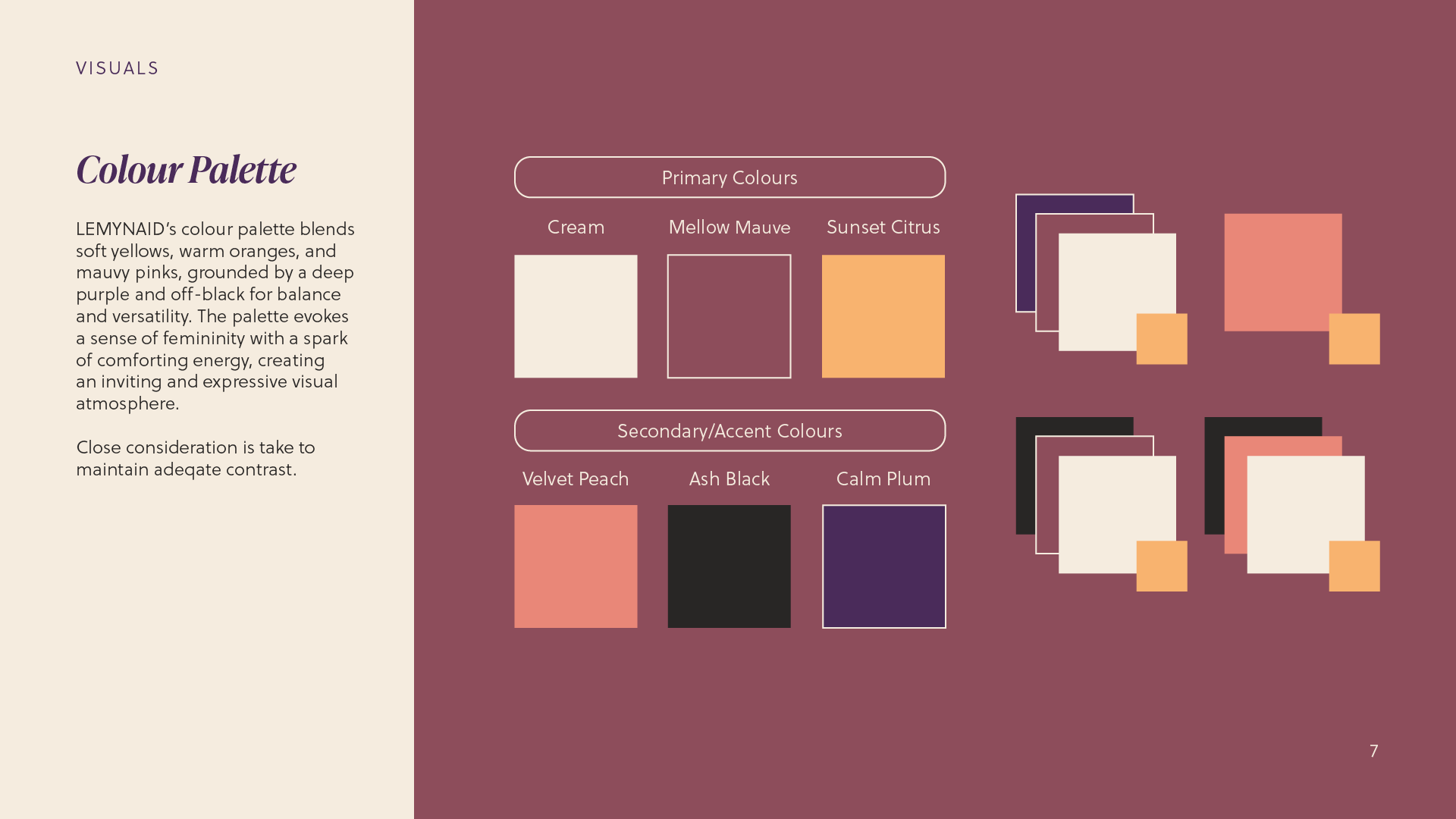
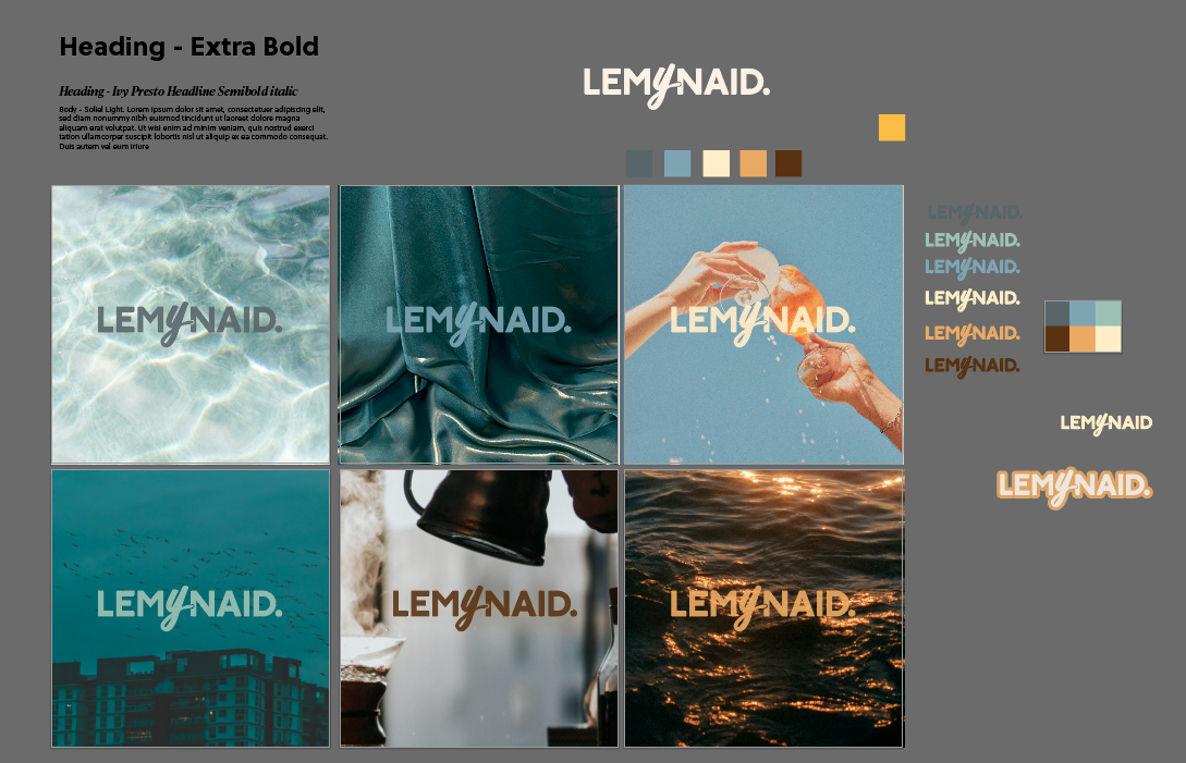
• Versatile Colour Palette - A versatile colour palette built for optimal contrast, balancing lively tones with a mature and sleek overall look.
Potential Iterations & Features
• Animated Elements – To complete the branding package, I will create motion graphic elements like video introductions, ending screens, stream alerts, and interactive elements.
• Ongoing Project – As this is a personal, ongoing project, deliverables may change and adapt.
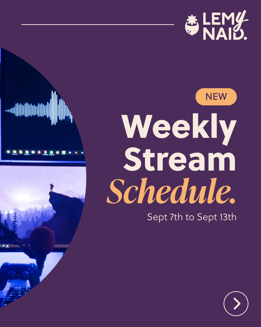
Pre-Brand Refresh Animated Screens

Challenges & Pain Points
• Personal Branding – Because this project represents my own identity, it naturally took more time than typical client work. I allowed myself the space to get granular with details, pushing for a level of refinement that reflected my voice. The process has been creatively fulfilling and has gone through multiple iterations, helping me sharpen both my visual and strategic design skills.
• Timeline Shifts – As a passion project, the timeline evolved organically, with periods of pause and reflection. While this presented scheduling challenges, it also allowed me to approach the rebrand more thoughtfully. The extended timeline led to more confident decisions and a brand I feel proud to stand behind.
Learnings & Improvements
• Feedback, Always – I anticipated collecting feedback even though this was a personal branding project, but I didn’t expect it to shape the outcome as much as it did. Incorporating perspectives from those close to me gave the brand a more well-rounded and externally informed identity, one that still feels authentically mine.
• Timeline & Planning – While the project took longer than expected, maintaining a plan and timeline, however flexible, was essential for staying organised. Mapping out deliverables helped ensure that nothing was overlooked and made the process much more manageable, even through periods of iteration and pause.
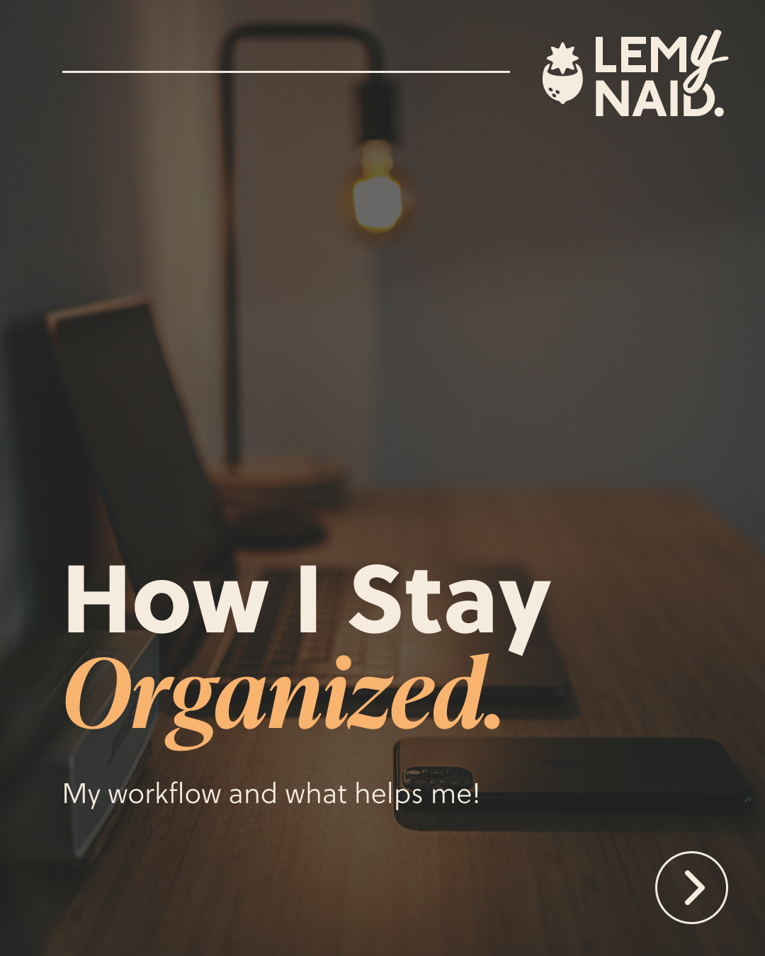
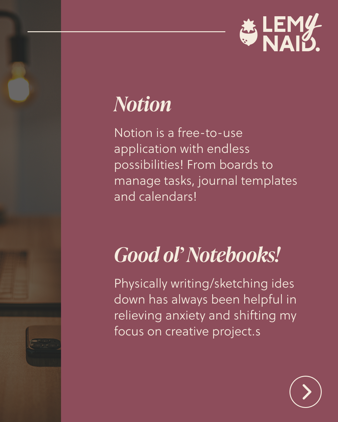
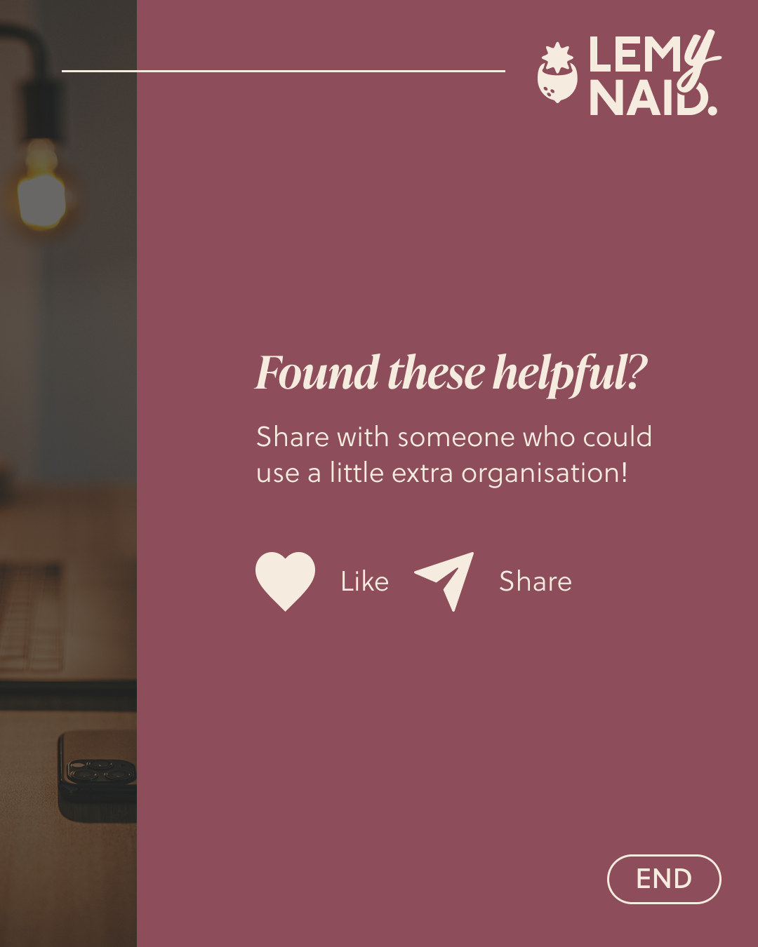
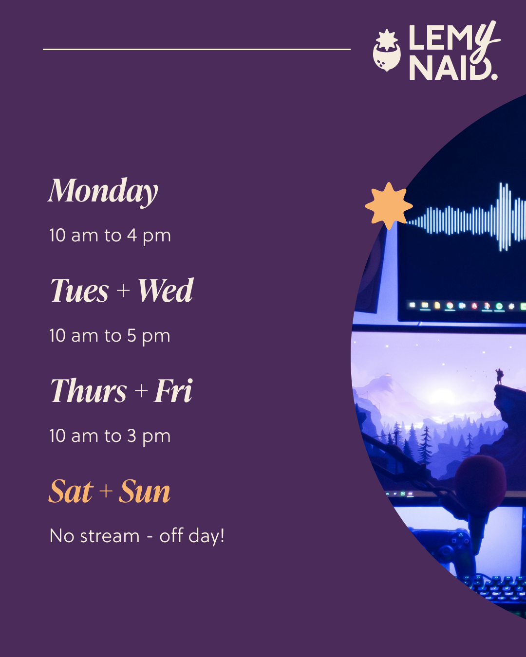
Social Post Templates (Instagram)

Final Outcome & Impact
This project resulted in a refined and versatile personal brand identity, supported by a fully developed style guide and adaptable assets, ensuring a consistent and intentional presence across digital platforms.
• Consistent Branding – Established a cohesive visual identity including a logo, colour palette, typography, and reusable digital assets, designed for flexibility across platforms like Instagram, YouTube, and Twitch.
• Comprehensive Brand Style Guide – Developed a detailed brand guideline outlining design principles, usage rules, and the intent behind visual decisions to maintain consistency across future content.
• Strategic Rollout Plan – Created an implementation roadmap for a phased rebrand launch, including asset production, feedback-driven refinements, and content scheduling aligned with audience engagement goals.
• Ongoing Project – As this is an ongoing project, more elements of the rebrand will be added as developed.
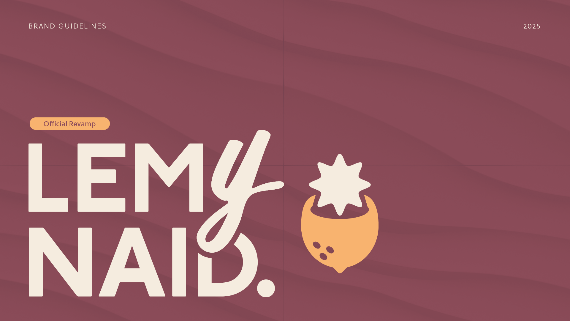
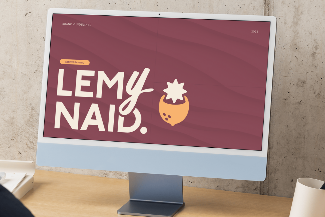
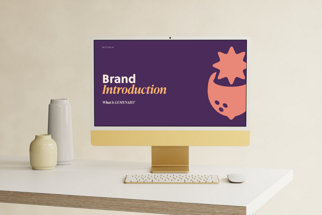
Brand Guidelines