Overview
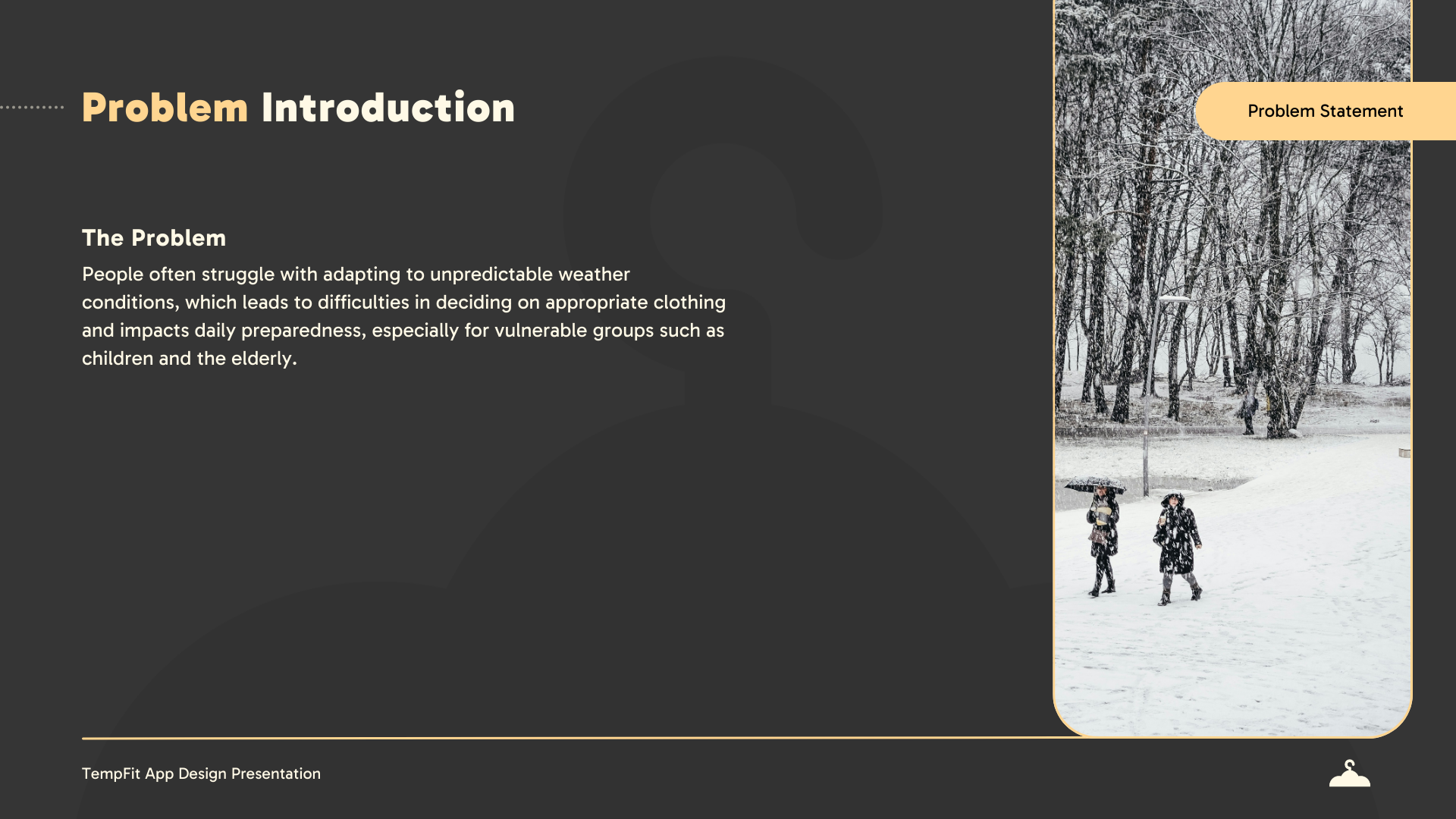
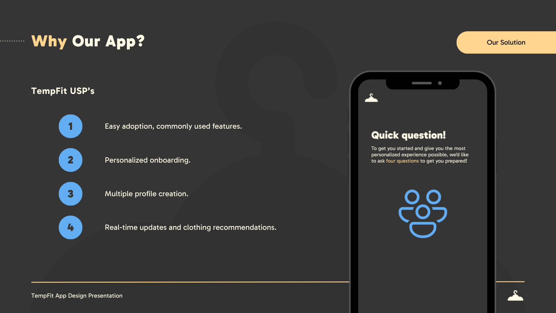
TempFit was created in my Design Studio I class to address weather-related harm, a growing issue in cities like Calgary, where extreme temperatures pose risks, especially to elderly individuals and young children. Our goal was to design an app that helps users and caregivers stay prepared, reducing weather-related discomfort and health risks through personalised alerts, outfit recommendations, and real-time updates.

My Role
As Lead Creative Designer, I focused on:
• Developing intuitive branding that aligned with the app’s tone and purpose.
• Designing slide decks and documents that reflected the TempFit brand across all touchpoints.
• Applying strong layouts and hierarchy to enhance clarity, structure, and storytelling.
• Ensuring visual consistency across presentation and documentation for a polished, professional finish.
Tools Used
• Figma/FigJam – User flows, wireframes, high-fidelity UI.
• Illustrator – Logo and branding elements.
• InDesign & Canva – Presentation & document templates.
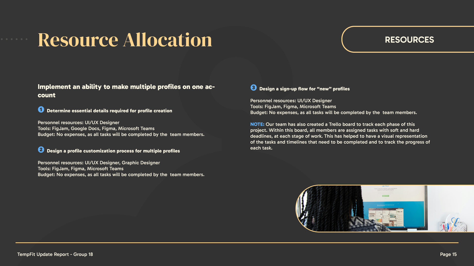
• Trello – Task tracking and iterative design workflow.
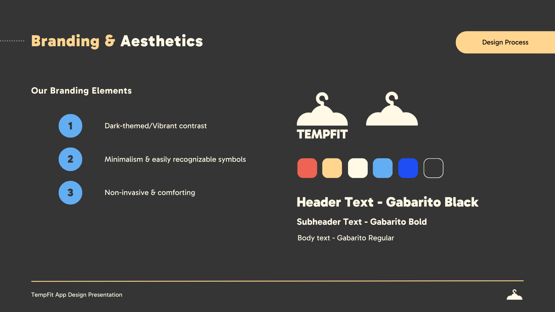
Logo, Colour Palette & Branding Ideation

Research & Process
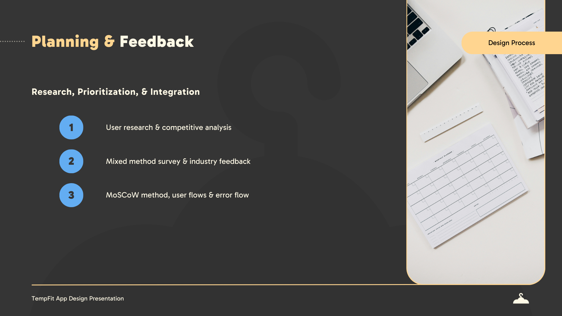
Our design process was feedback-driven and involved:
• Visual Identity Development – Our team collaborated on the creation of a strong visual identity, establishing typography, colour palettes, and design aesthetics that reflected the app’s tone and purpose.
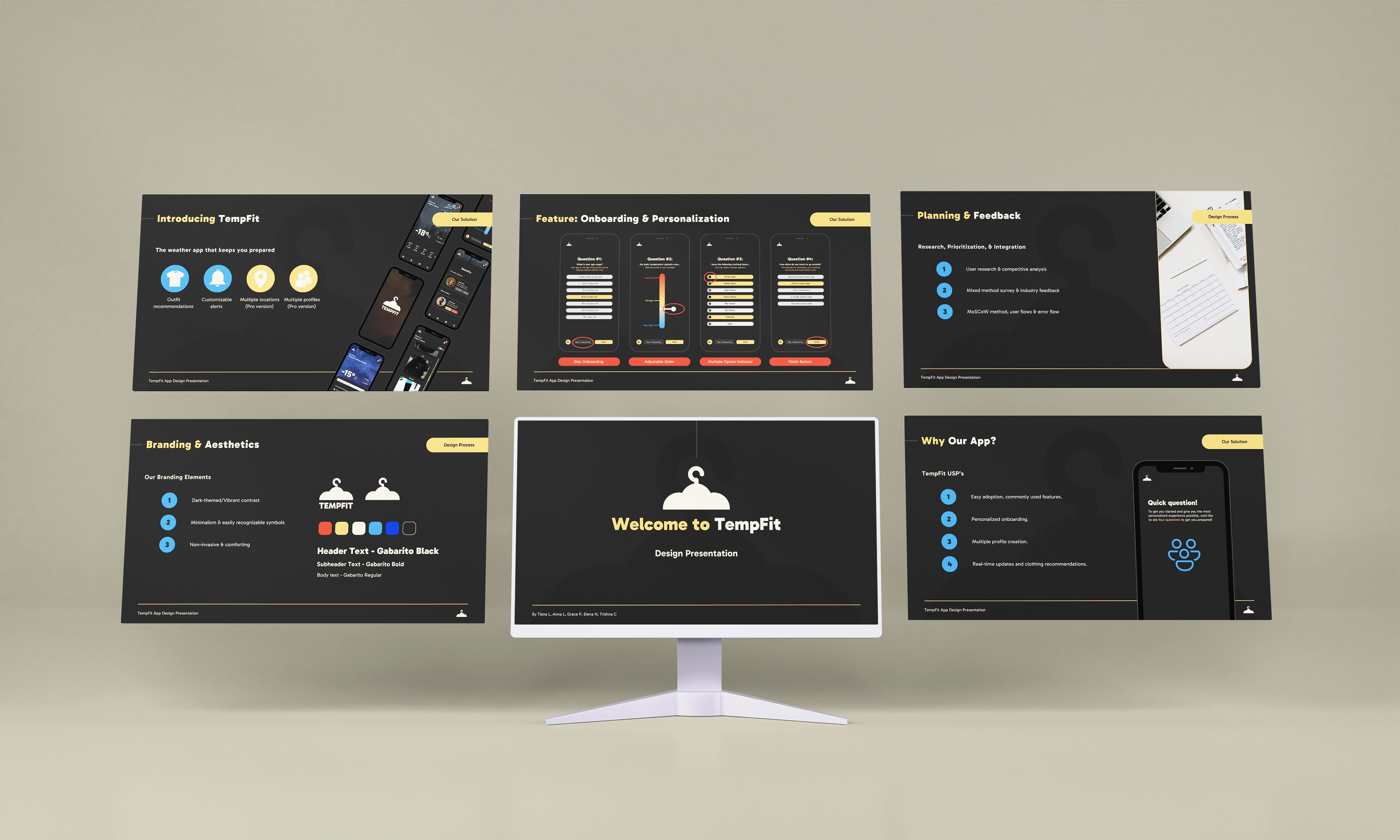
• Document & Presentation Design – I led the creation of branded assets, including slide decks and reports, using consistent layout systems, visual hierarchy, and accessible design principles.
• Feedback-Driven Refinement – Presentation materials and supporting documents were revised based on peer, instructor, and industry feedback to ensure they communicated the project clearly and professionally.
• Brand Consistency Across Touchpoints – From logo usage to typography and spacing, I ensured that every piece aligned with the TempFit brand, maintaining visual coherence throughout.
• Strategic Communication Design – All materials were crafted to support storytelling and understanding, guiding the audience through our research, process, and solutions with clarity and impact.
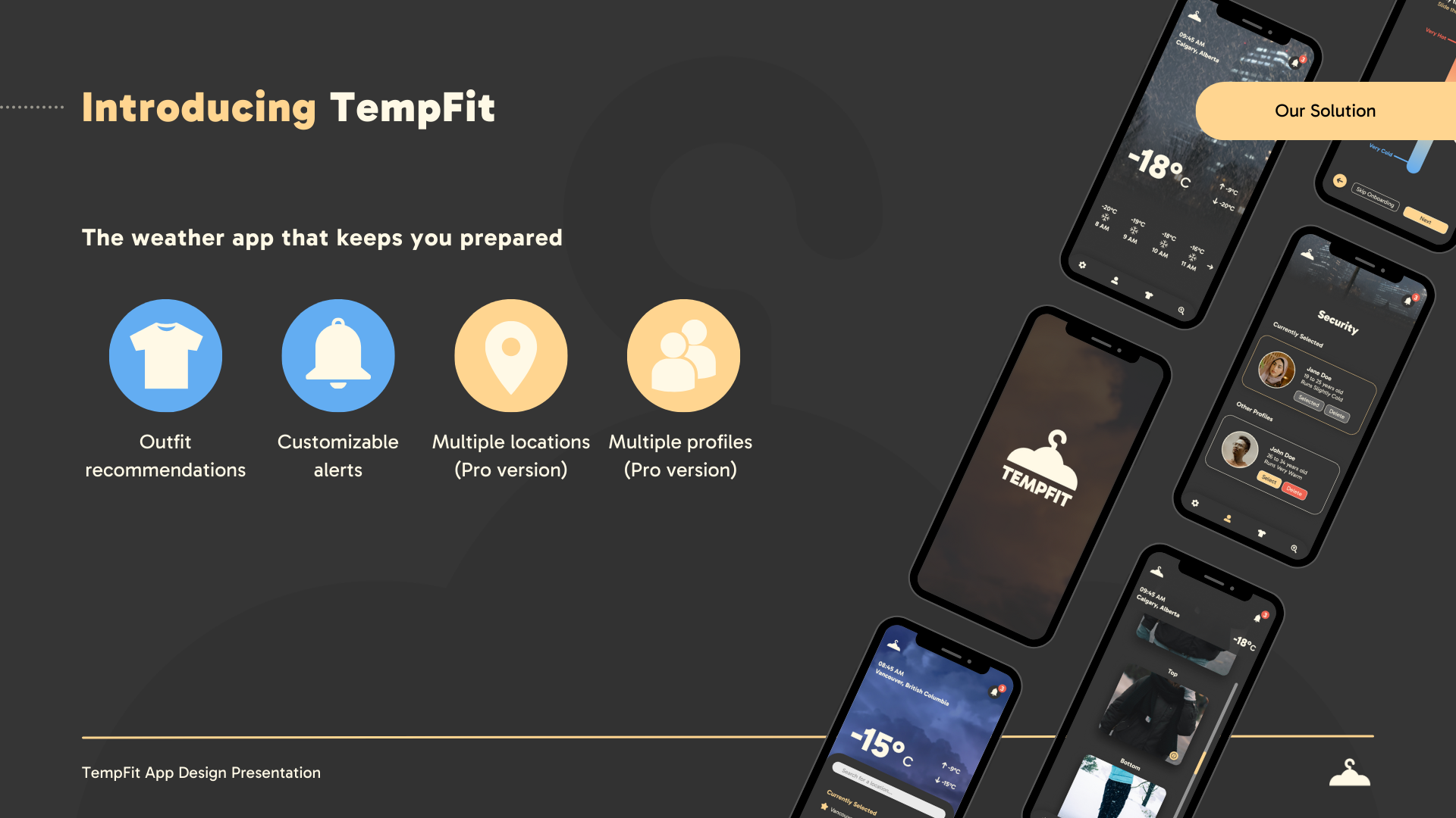
Key Features
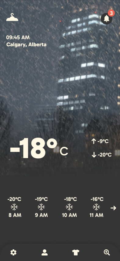
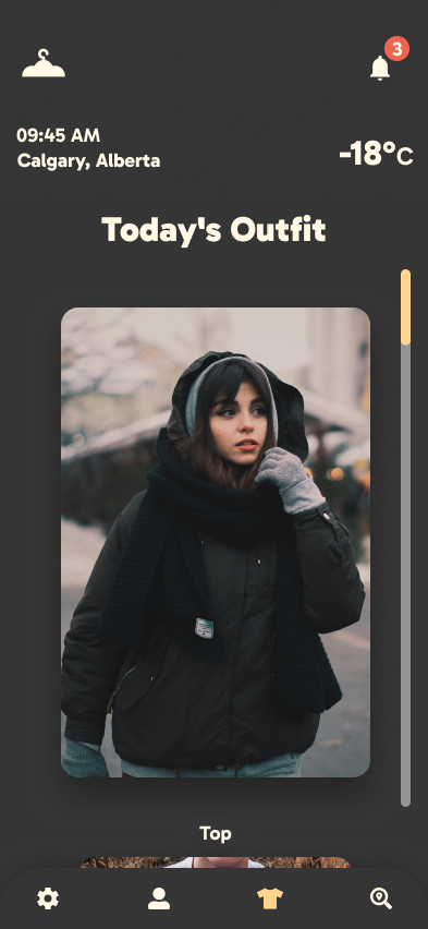
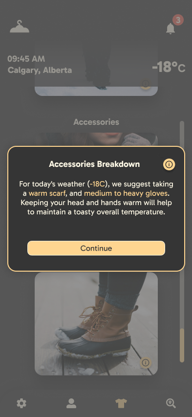
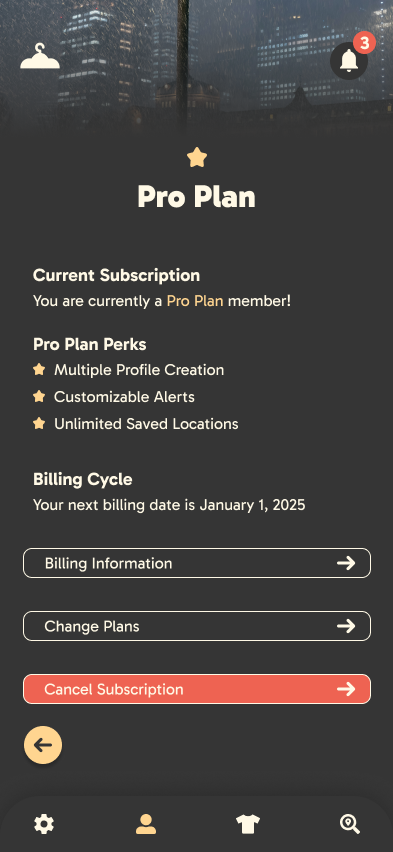
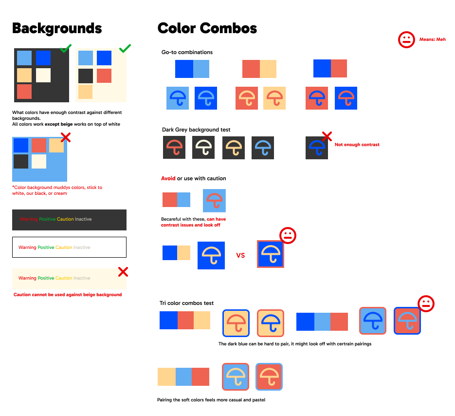
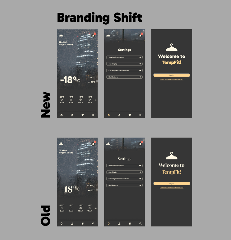
• Dark theme, Intentional Contrast – Used an off-black base to let brand colours stand out. Warm oranges and yellows contrast with saturated blues, creating a vibrant, accessible palette with a strong visual hierarchy.
• Consistent Branding Across Deliverables – Maintained a cohesive visual system across documents and presentations through consistent use of type, colour, spacing, and layout.
Potential Iterations & Features
• Marketing Website – Extending TempFit’s branding into a website would strengthen its digital presence and complete the brand ecosystem.
• Print Materials – Creating business cards or flyers could expand the brand into physical spaces and support outreach or partnerships.
Update Report - Integrating Feedback


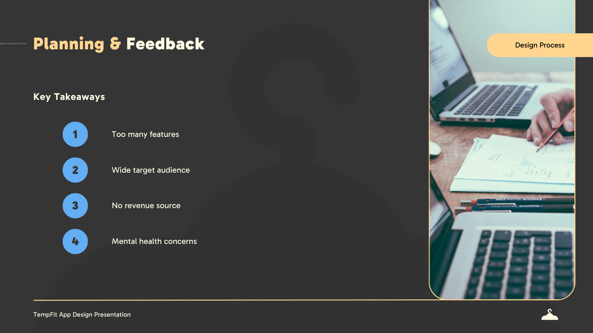
Challenges & Pain Points
• Designing for a Broad Audience – Creating branding that could resonate with a wide range of users, including seniors, parents, and kids, required a careful balance of approachability and clarity.
• Logo & Typography Balance – Designing a sleek, recognisable logo with accessible, easy-to-read typography challenged us to prioritise clarity without sacrificing style.
Learnings & Improvements
• Design System Only – While we didn’t create a full brand guideline, we maintained consistency through a one-pager and a shared design system that aligned all visuals and layouts. If done differently, fully fleshing out a brand guideline would be helpful.
• Minimalism Creates Flexibility – Keeping the branding minimal allowed us to express identity through layout, structure, and colour, highlighting how simplicity can still deliver strong brand recognition.

Final Outcome & Impact
This project resulted in a collection of high-fidelity screens and a cohesive brand identity, ensuring visual consistency and a polished presentation of the app’s core features.
• Consistent Branding – Developed a unified visual identity, including a refined logo, colour palette, typography, and UI components, maintaining design consistency across all deliverables.
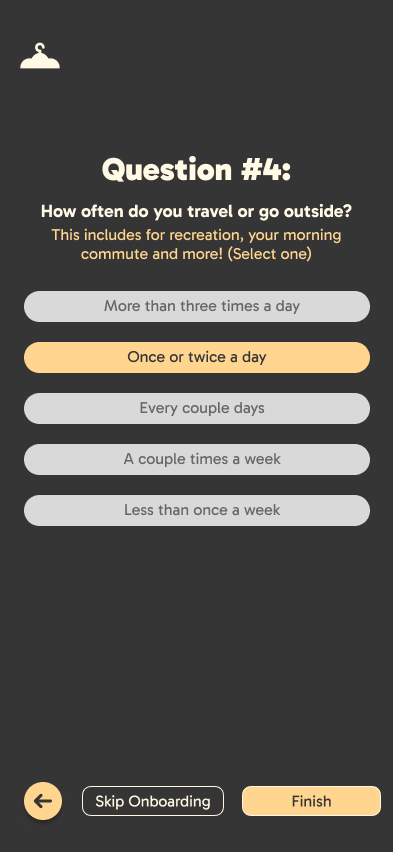
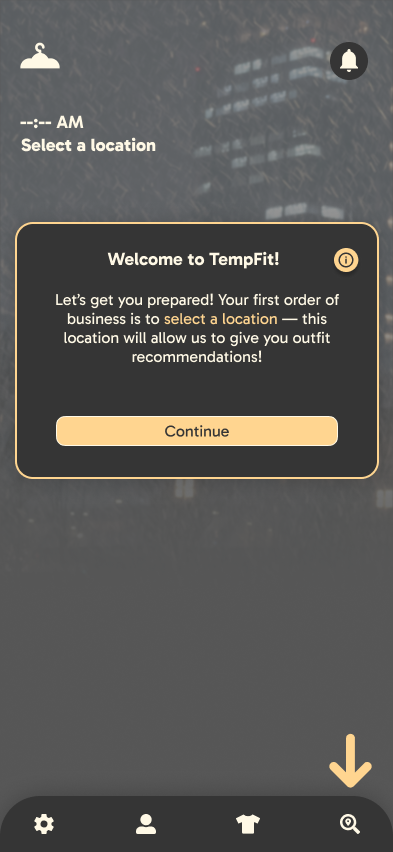
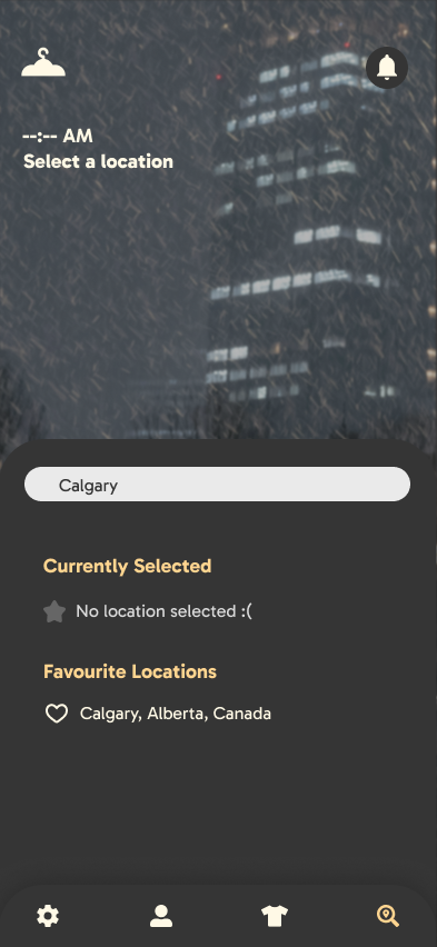
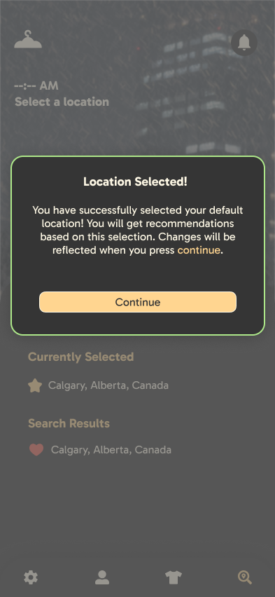
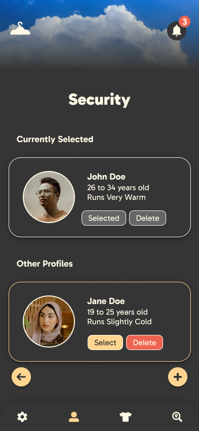
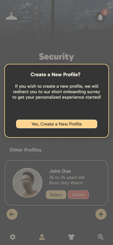
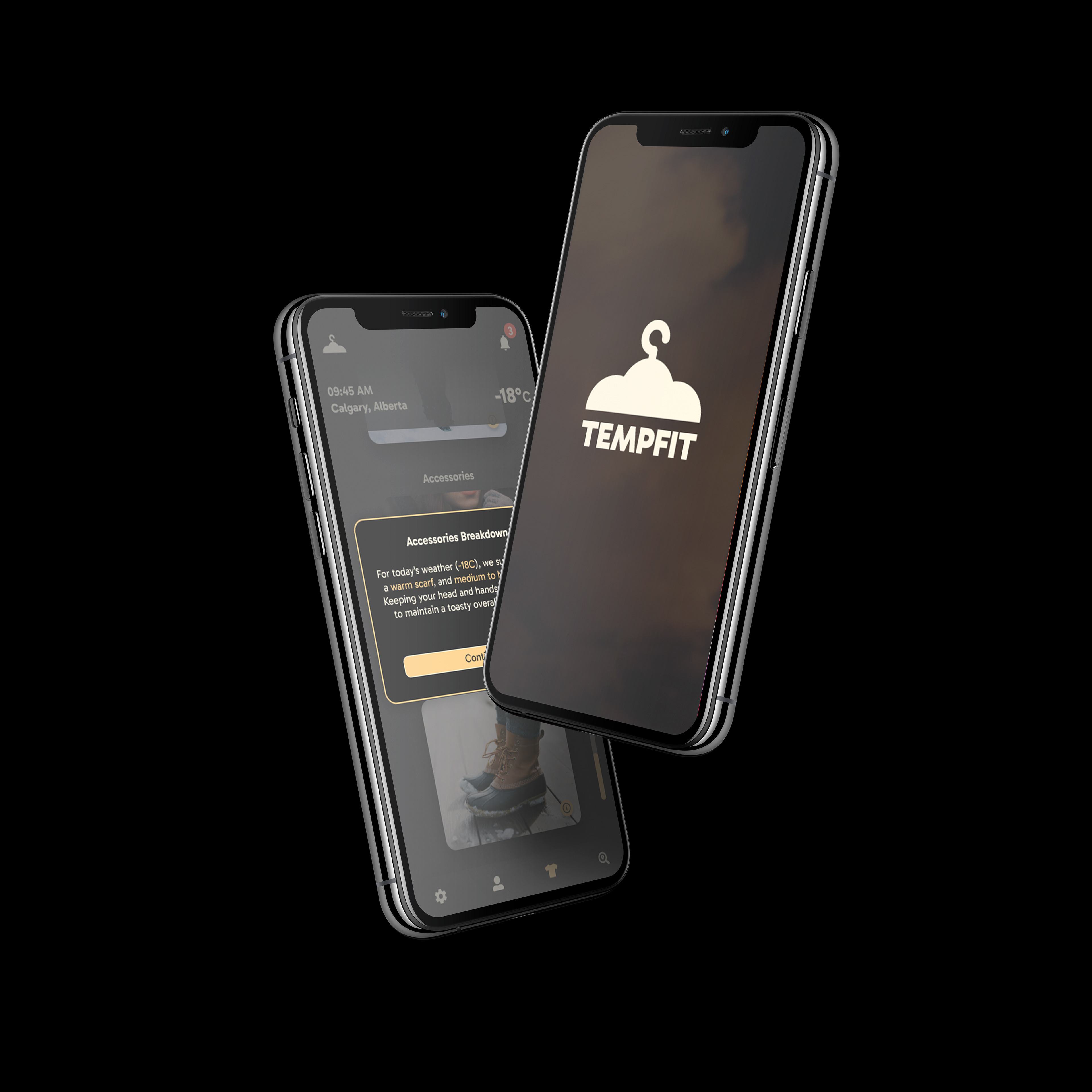
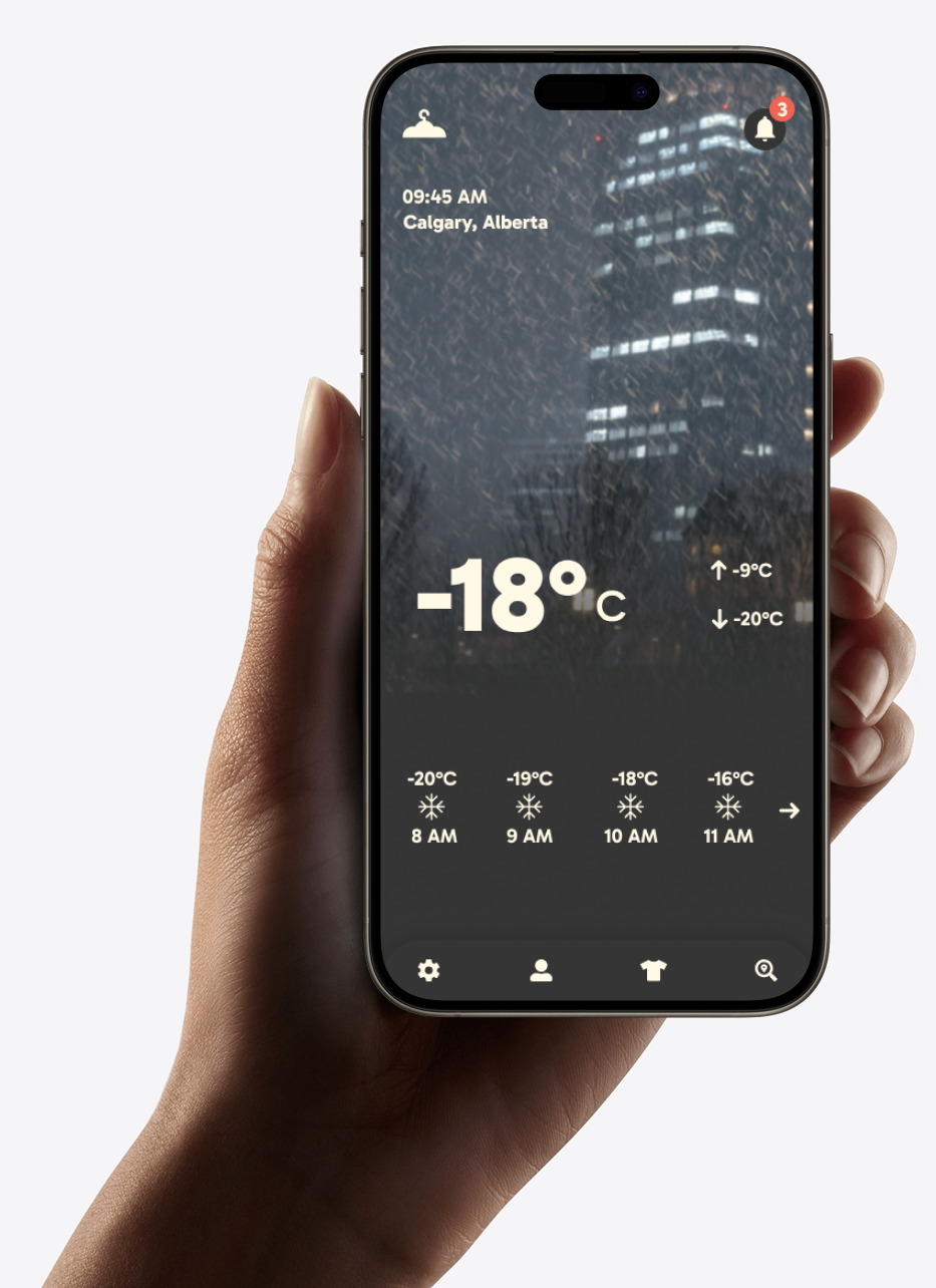
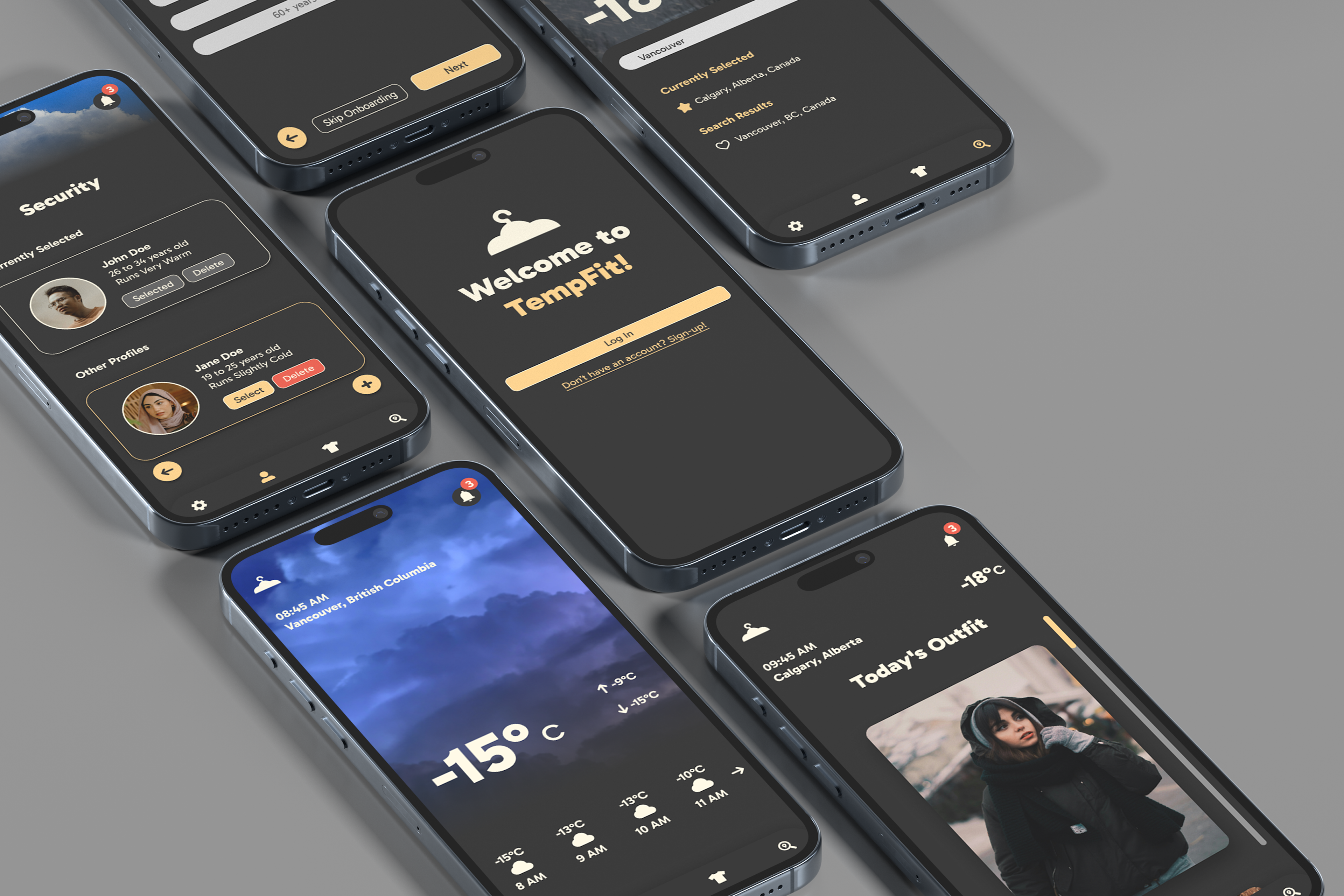
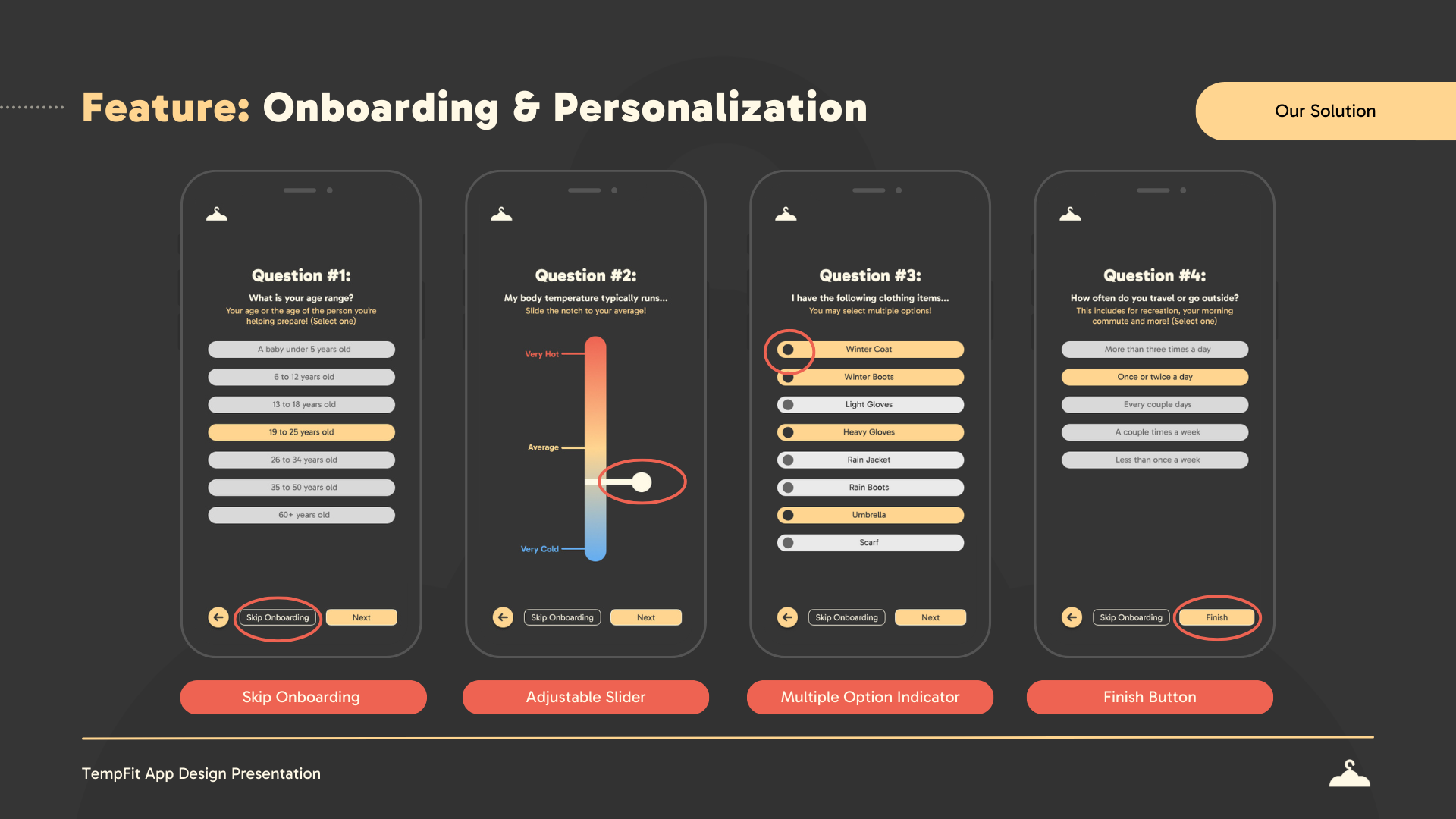
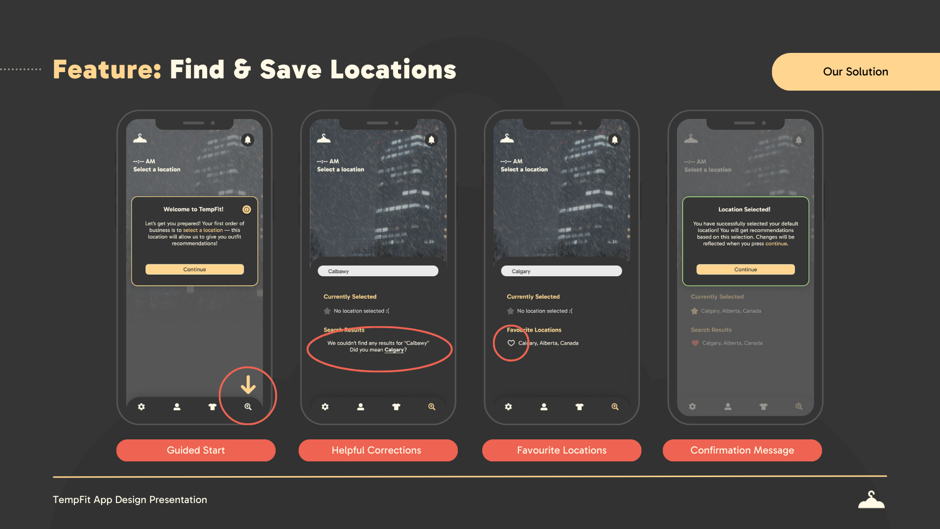
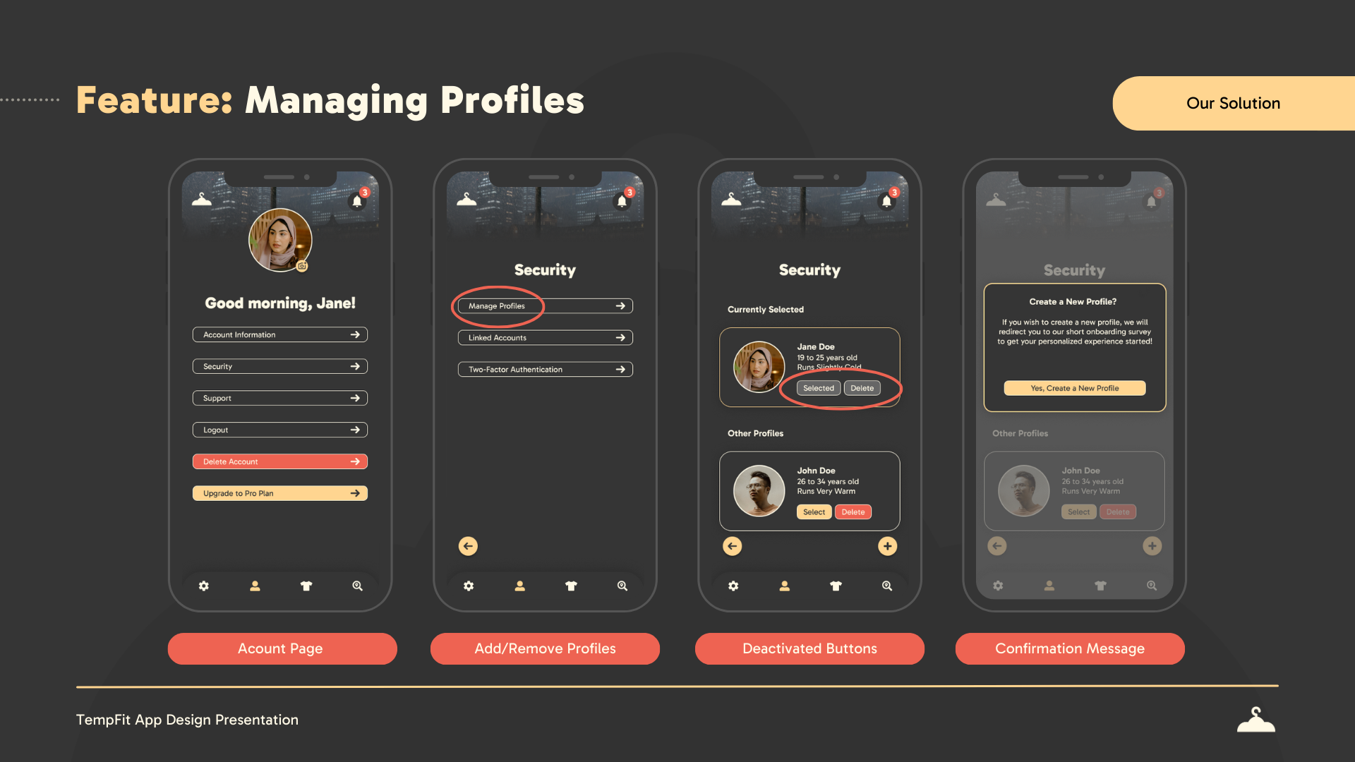
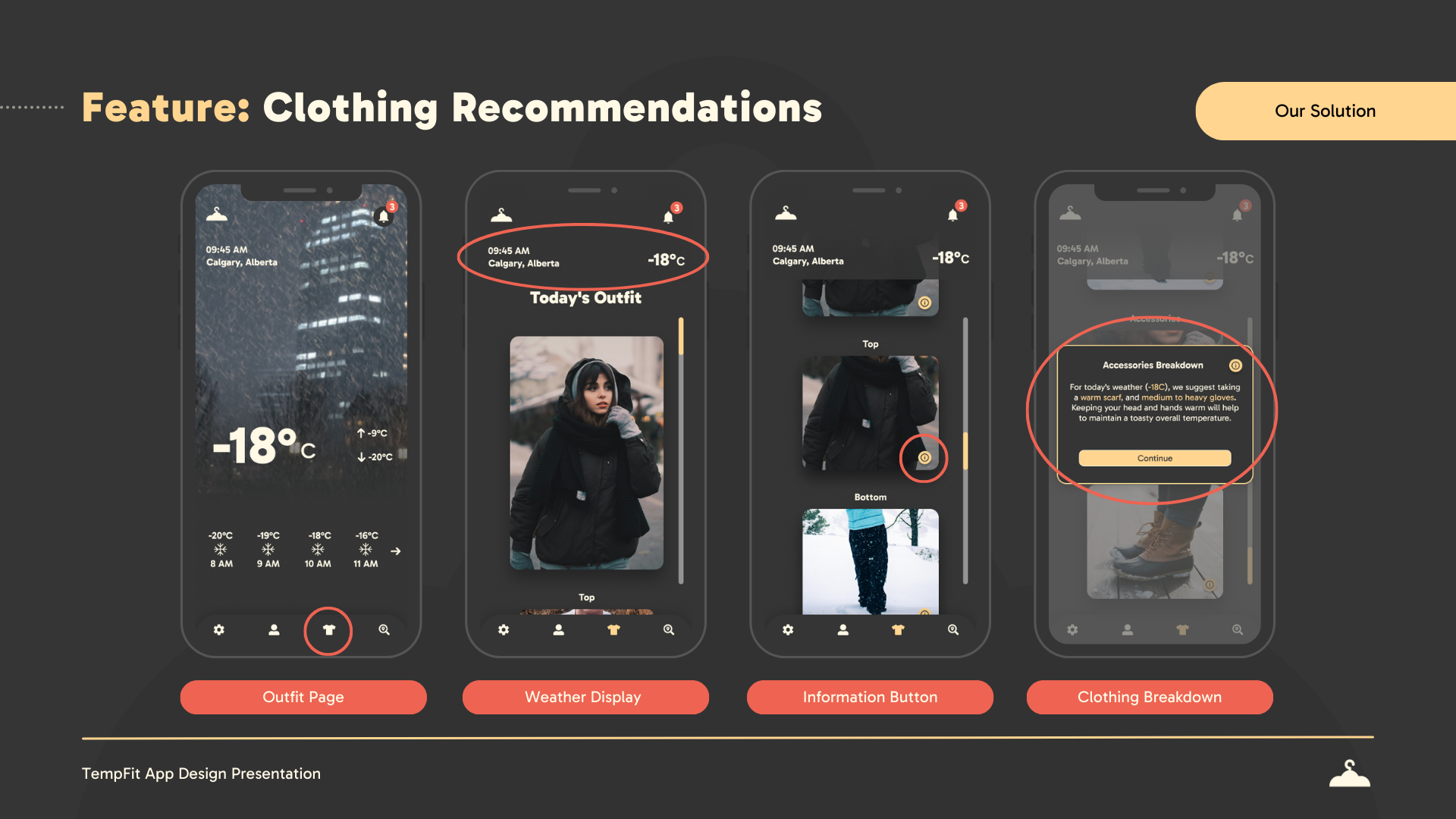
• High-Fidelity Screens – Designed detailed app screens that effectively showcased the app’s core functionality and visual direction, helping to communicate the user experience.
• Final Presentation & Document Design – Created structured presentation templates and branded documents, ensuring professionalism and clarity for stakeholder review.
Final Presentation Design


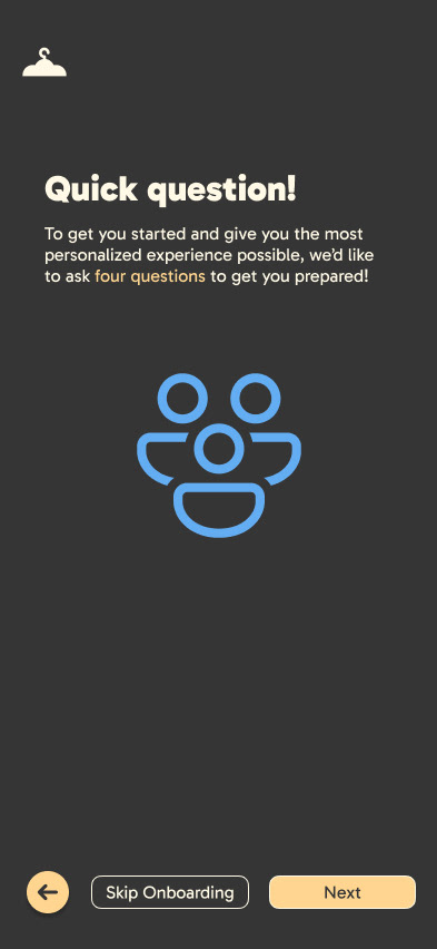
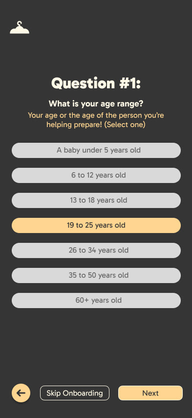
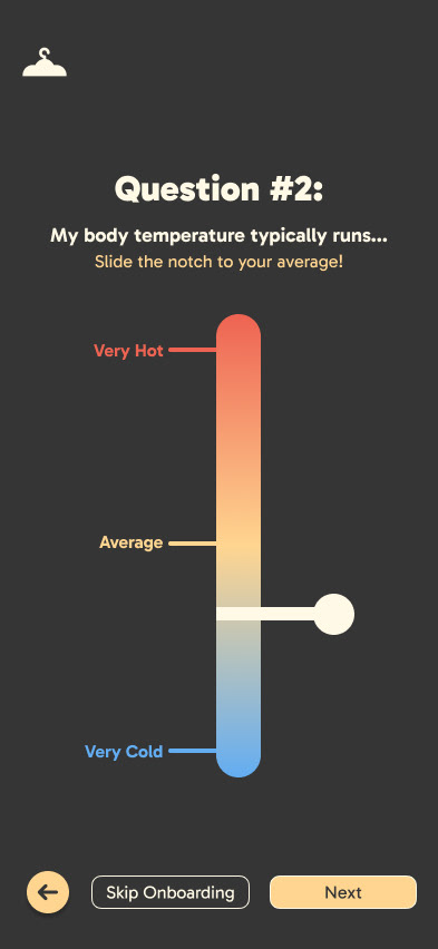
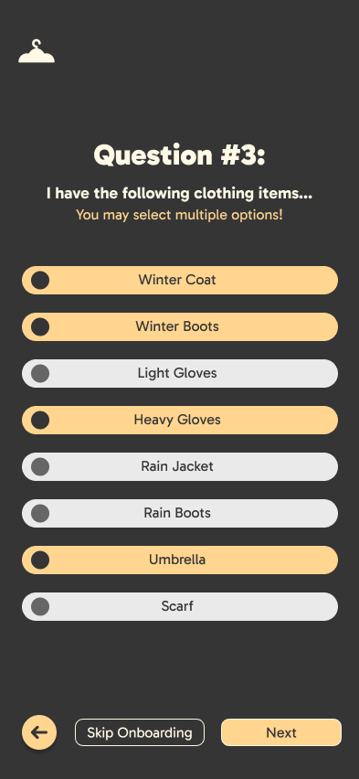
High-Fidelity Screens